Best Color Combinations For Your Website
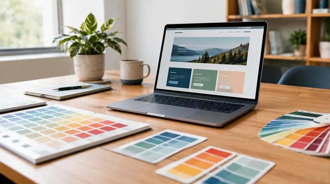
When designing a website, selecting an effective color scheme is essential to establishing a visually appealing, functional, and intuitive user experience. Color choices convey distinct emotions, set the tone for your brand, and directly influence how visitors navigate through content and interpret key information. Because individual hues rarely stand alone in web architecture, the relationship between primary base tones, structural elements, and accent highlights determines whether a layout feels cohesive and accessible or cluttered and visually exhausting.
Every color carries distinct psychological associations and functional properties that shape user engagement from the moment a page loads. By understanding how classic and contemporary color combinations operate across interfaces, site owners, developers, and designers can craft an intentional visual identity that reinforces brand credibility, enhances typography readability, and guides visitors effortlessly toward conversions.
Key takeaways
- Strategic color combinations shape brand identity, direct visual hierarchy, and govern user navigation across digital interfaces.
- High-contrast pairings like black and white optimize clarity and legibility, while complementary pairings like blue and orange balance trustworthiness with high-impact calls to action.
- Earthy and neutral palettes, such as green with brown or grey with yellow, establish grounded stability and modern sophistication across specialized industries.
- Successful web color implementation relies on assigning explicit roles to dominant backgrounds, structural layout elements, and high-visibility accent highlights.
- Testing text contrast across devices and avoiding the overuse of hyper-saturated hues prevents visual fatigue and user disorientation.
Overview of top website color combinations
Different color pairings evoke distinct moods and serve different communicative purposes across digital layouts. Evaluating how colors interact in terms of energy, visual balance, and emotional resonance helps teams identify the ideal foundation for their industry and audience.
| Color pairing | Key emotional associations | Recommended industries | Visual dynamic |
|---|---|---|---|
| Black and White | Simplicity, elegance, clarity | Modern portfolios, minimalism, editorial sites | Maximum tonal contrast and legibility |
| Blue and Orange | Trust, stability, excitement, warmth | Corporate, technology, dynamic digital services | Complementary contrast between cool trust and warm energy |
| Green and Brown | Serenity, growth, nature, security | Health, wellness, outdoor living, sustainability | Organic, earthy harmony and calming balance |
| Purple and Yellow | Luxury, creativity, royalty, optimism | Fashion, beauty, creative arts, culture | Sophisticated richness balanced by cheerful luminosity |
| Red and Yellow | Passion, urgency, joy, warmth | Food, sports, entertainment, hospitality | High-stimulation, attention-grabbing warmth |
| Grey and Yellow | Professionalism, innovation, optimism | Finance, consulting, enterprise software | Structured neutral stability lifted by bright accents |
| Pink and Blue | Playfulness, fun, sweetness, trust | Children's products, toys, creative fashion | Whimsical balance of warm charm and cool dependability |
The best color combinations for modern web design
Selecting a palette requires evaluating how two distinct hues communicate brand identity, guide the user's focus, and maintain long-term browsing comfort. Below is an examination of seven highly effective pairings, their psychological associations, and the contexts where they perform best.
Black and White

- Core moods: Simplicity, cleanliness, elegance
- Best applications: Minimalist designs, editorial platforms, portfolio showcases
- Primary attributes: Maximum contrast, timeless versatility, structured clarity
Black and white represents a timeless design foundation that adapts seamlessly to almost any digital medium. This combination is simple, clean, and elegant, making it an enduring favorite for modern and minimalistic website designs. Beyond its aesthetic restraint, the pairing delivers the highest possible level of tonal contrast, which ensures crisp typographic legibility and effortless content scanning.
Because black and white acts as a neutral canvas, it allows photography, artwork, and product imagery to take center stage without competing with interface colors. Designers frequently use black and white as an architectural baseline, introducing deliberate accent colors to direct user attention to critical interaction points while preserving an uncluttered, sophisticated presentation.
Blue and Orange

- Core moods: Trust, professionalism, excitement, warmth
- Best applications: Technology platforms, corporate services, interactive portals
- Primary attributes: Complementary wheel positioning, sharp call-to-action distinction
Blue and orange is a widely favored pairing for websites seeking to strike an immediate balance between dependability and dynamic action. In design psychology, blue represents trust, professionalism, and stability, creating a reassuring environment for site visitors. In contrast, orange delivers enthusiasm, warmth, and excitement, instantly enlivening the interface.
Because blue and orange sit opposite one another on the traditional color wheel, they form a natural complementary contrast. When a cool blue serves as the foundational tone across headers and structural sections, warm orange accents naturally jump off the screen. This makes orange exceptionally effective for high-value conversion elements, including checkout buttons, demo requests, and newsletter signups.
Green and Brown

- Core moods: Serenity, growth, stability, warmth
- Best applications: Health and wellness, outdoor lifestyle, sustainable ventures
- Primary attributes: Earth-toned harmony, organic grounding, calming aesthetic
Green and brown form an organic, earthy pairing that immediately evokes nature, tranquility, and holistic well-being. Green is universally linked to health, rejuvenation, and environmental vitality, while brown provides an underlying sense of security, warmth, and dependability. Together, they create a calming visual environment that puts visitors at ease.
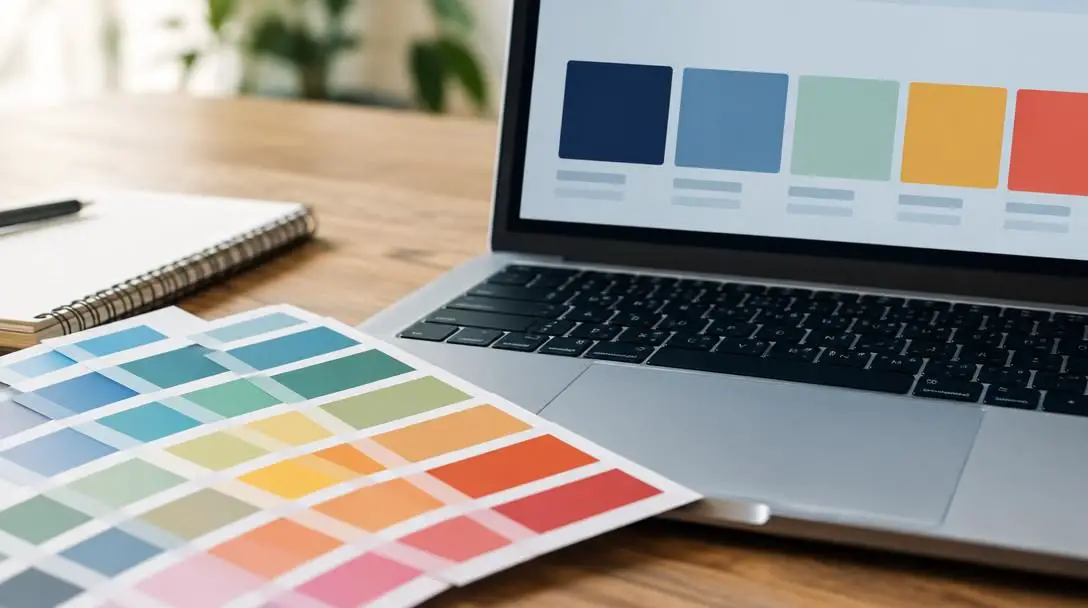
This color combination is particularly well suited for organizations centered around sustainable goods, agriculture, holistic medicine, and outdoor pursuits. By mirroring the natural world, green and brown establish an honest, grounded brand identity that reassures environmentally conscious consumers seeking authentic, dependable offerings.
Purple and Yellow

- Core moods: Luxury, sophistication, creativity, joy
- Best applications: Fashion labels, creative agencies, beauty brands, arts portals
- Primary attributes: High-impact complementary contrast, artistic richness
Purple and yellow combine regal elegance with infectious optimism. Historically connected to royalty, wealth, and visionary thinking, purple supplies depth, contemplation, and creative prestige. Yellow balances this quiet grandeur by injecting radiant energy, cheerfulness, and bright focus.
When implemented thoughtfully, this complementary duo offers striking visual differentiation. The deep presence of purple establishes an aura of premium quality, while splashes of luminous yellow prevent layouts from feeling overly heavy or unapproachable. Platforms dedicated to contemporary fashion, artisan products, and visual arts thrive on this interplay between artistic sophistication and joyful expression.
Red and Yellow

- Core moods: Excitement, passion, urgency, joy
- Best applications: Food delivery, dining, sports hubs, entertainment media
- Primary attributes: Warm-spectrum dominance, high visual appetite, urgent focal points
Red and yellow forms an intensely energetic, bold color pairing that immediately commands user attention. Red signals action, passion, and rapid movement, while yellow contributes radiant joy, optimism, and warmth. Because both hues belong to the warm side of the color spectrum, they generate a stimulating environment that encourages decisive interaction.
This pairing has long been a staple of the food, sports, and entertainment sectors, where sparking appetite, enthusiasm, and urgency is vital. Red draws the eye directly toward limited-time promotions and action buttons, while yellow softens the aggression of red with friendly luminosity. When balanced carefully to avoid overwhelming the reader, red and yellow creates an undeniably memorable browsing atmosphere.
Grey and Yellow

- Core moods: Modernity, stability, innovation, optimism
- Best applications: Enterprise technology, financial services, executive consulting
- Primary attributes: Neutral architectural anchoring, crisp intellectual accenting
Grey and yellow offers a refined, contemporary balance between disciplined professionalism and innovative flair. Slate, charcoal, and cool grey shades communicate corporate stability, architectural order, and quiet confidence. Yellow cuts through this neutral backdrop with bright, optimistic sparks of creativity and forward-looking momentum.
This pairing has gained significant traction across the technology, consulting, and financial sectors. Rather than relying on monotonous corporate palettes, forward-thinking enterprises use grey to establish structured layouts, crisp card divisions, and readable text, while employing yellow accents to highlight data metrics, innovative feature announcements, and conversion paths.
Pink and Blue

- Core moods: Playfulness, sweetness, trust, imagination
- Best applications: Children's products, toy retailers, modern lifestyle and apparel
- Primary attributes: Approachable warmth balanced by structural dependability
Pink and blue creates a lighthearted, imaginative visual experience that feels approachable and charming. Pink conveys warmth, romance, and sweetness, while blue contributes a foundational sense of reliability, professionalism, and calmness. The pairing strikes a harmonious balance between youthful enthusiasm and functional stability.
Digital storefronts and community platforms catering to family lifestyle goods, toys, and contemporary fashion benefit greatly from this pairing. The cool clarity of blue keeps navigation clean and reassuring, while soft or vibrant pink accents introduce warmth and artistic flair, inviting users to explore product catalogs in a friendly, low-pressure digital setting.
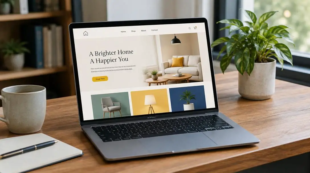
The relationship between primary base tones, structural elements, and accent highlights dictates whether a digital layout feels cohesive and accessible or cluttered and jarring.
How color combinations work in website architecture
Selecting two attractive colors is only the first step; integrating them into a functional website requires understanding operational visual hierarchy. Digital interfaces depend on a structured distribution of color across three distinct layers: dominant foundation tones, structural interface elements, and high-impact accent tones.
Dominant background tones occupy the largest surface area of your site, including page backgrounds, primary canvas containers, and major structural section dividers. In pairings like black and white or grey and yellow, the neutral tone almost always serves as the dominant foundation. By allocating large expanses to clean, unobtrusive shades, websites provide visual breathing room and prevent cognitive fatigue during extended reading sessions.
Structural interface components organize the digital space and help users understand how information is grouped. These elements include navigation sidebars, card containers, dropdown menus, table borders, and dividing rules. Using muted variations of your secondary color or balanced neutrals for structural blocks creates clear visual boundaries without distracting from the actual text and media.
Accent highlights represent the most active tier of your color system. In combinations like blue and orange or purple and yellow, the brighter or warmer hue is reserved almost exclusively for conversion elements, interactive states, notification badges, and links. If high-visibility colors are applied universally across both backgrounds and buttons, users lose the ability to distinguish interactive components from decorative graphics.
Practical steps for implementing your palette
Transitioning from an abstract color pairing to a fully responsive, accessible website requires a methodical implementation workflow. Following these structured steps ensures that your palette remains cohesive across every page template and screen size.
- Identify your primary brand tone. Select the single color that most authentically encapsulates your brand's core identity and emotional value, whether that is the dependable professionalism of blue, the earthy tranquility of green, or the luxurious creativity of purple.
- Select a complementary or supporting partner. Pair your primary hue with an appropriate counterpart that fulfills your communicative goals, such as pairing blue with orange for energetic contrast or combining grey with yellow for modern sophistication.
- Determine dominant neutral foundations. Establish clean background canvases using white, off-white, slate, or deep charcoal to ensure visual breathing room and prevent interface clutter.
- Assign explicit functional roles to each color. Clearly map every hue to an interface responsibility, determining exactly which shade represents clickable buttons, which color denotes warnings, and which neutral governs body copy.
- Develop varying shades and tints. Generate lighter tints for card backgrounds and hover states, along with deeper shades for active buttons and headings, expanding the versatility of your palette without introducing chaotic new hues.
- Audit text contrast across all screen sizes. Verify that all text blocks meet digital contrast requirements against their respective backgrounds so that content remains effortlessly readable under diverse lighting conditions.
- Build interactive mockups. Apply your color rules to real wireframes containing actual content, buttons, and form inputs to evaluate usability, balance, and visual comfort before publishing.
Common web color mistakes to avoid
Even carefully selected palettes can falter if implemented without attention to visual ergonomics and user expectations. Avoid these common design pitfalls when rolling out your website's color system:
- Overusing high-energy accent shades: Saturated warm tones like orange, red, and yellow are designed to attract attention. Flooding entire page backgrounds with these hues overwhelms visitors and causes visual fatigue.
- Neglecting contrast standards: Placing light yellow text on a white card or dark grey copy against a black background makes reading difficult and creates accessibility barriers for users with visual impairments.
- Inconsistent interactive cues: Using an accent color for clickable buttons on your home page but reassigning that same color to non-clickable decorative titles on product pages confuses users about what can be clicked.
- Ignoring industry context: Utilizing aggressive, high-energy pairs like red and yellow for a clinical mental health practice, or playful pink and blue for a corporate restructuring firm, creates an emotional mismatch with user expectations.
- Relying exclusively on pure hues: Using only the most intense, fully saturated versions of your two colors produces a flat, aggressive design. Sophistication comes from blending subtle tints, deeper shades, and balanced neutrals alongside your primary colors.
Frequently asked questions
How many colors should a website use?
Most effective websites rely on a focused palette consisting of one primary brand tone, one supporting or accent color, and two to three neutral foundation shades for backgrounds, text, and structural dividers. Limiting your palette preserves visual hierarchy and keeps the interface clean.
Which color combination provides the best reading legibility?
Black and white offers the highest possible level of tonal contrast, making it the premier choice for typography legibility and content-heavy editorial layouts. Dark grey text on an off-white background offers comparable clarity while reducing optical glare.
Why is blue and orange so common in corporate and tech web design?
Blue and orange are complementary colors that sit opposite each other on the color wheel. Blue conveys security, professionalism, and trust, while orange provides an energetic contrast that draws the human eye directly to interactive buttons and conversion elements.
Can vibrant colors like red and yellow work outside the food industry?
Yes. While red and yellow are staples of the food and entertainment industries, they can be successfully used in sports platforms, event portals, and digital promotions where conveying excitement, urgency, and high energy is essential.
How do tints and shades improve a two-color website palette?
Tints and shades allow designers to create depth, indicate hover states, and separate content containers without adding conflicting hues. Lightening or darkening your base colors creates a unified, flexible visual system that looks refined and cohesive.
The bottom line
Choosing the right color combination for your website is a fundamental step in building an engaging digital presence. The right palette conveys core brand values, shapes emotional responses, and creates an intuitive pathway that guides visitors toward key actions. By assessing the unique psychological attributes of classic pairings—from the timeless clarity of black and white to the dynamic harmony of blue and orange—designers can construct interfaces that are both aesthetically pleasing and operationally sound.
As you implement your chosen scheme, remember that balance and contrast are paramount. Ground your layouts with clean neutral foundations, reserve saturated tones for meaningful interactive elements, and audit contrast across multiple devices and display panels. A well-structured color system not only elevates brand perception but also ensures your digital platform remains accessible, engaging, and memorable for every visitor.