
From RGB to CMYK: A Guide to Color Conversion for Web Designers
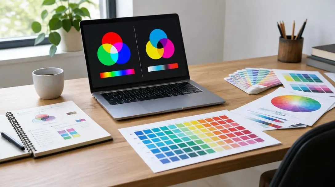
Color serves as one of the most critical foundational elements in graphic and web design. It carries the weight of brand identity, dictates visual hierarchy, shapes user experience, and evokes immediate emotional reactions from visitors. When designing user interfaces, marketing banners, and web layouts, digital creators often take it for granted that the vivid hues glowing on a high-definition monitor will translate cleanly everywhere. Yet, a jarring friction emerges whenever digital creative assets must transition into physical formats such as business cards, promotional flyers, event brochures, retail packaging, or custom corporate merchandise.
A color on a computer screen does not exist in the physical world as ink, pigment, or dye. It exists exclusively as illuminated light transmitted directly into the viewer's eyes. When web designers migrate from interactive digital products to tangible physical collateral, they collide directly with the physical limitations of commercial printing presses, chemistry, and paper substrates. Understanding the underlying physics and technical mechanics that separate screen displays from commercial printing is essential for preserving aesthetic integrity across all brand touchpoints.
Key takeaways
- Digital displays generate color through the additive RGB model of emitted light, whereas commercial print relies on the subtractive CMYK model of light-absorbing ink pigments.
- The RGB color spectrum possesses a substantially wider color gamut than CMYK, meaning saturated neons and electric tones cannot physically reproduce on standard paper.
- Overwriting master RGB files during conversion causes irreversible loss of vibrant color data, making distinct file preservation mandatory.
- Failing to convert files manually forces commercial print software to execute automated conversions on the fly, often producing unpredictable color shifts.
- Establishing dual color specifications for digital and print within brand style guides prevents inconsistent visual representation across marketing collateral.
The physics of screen light: Understanding the additive RGB model
RGB stands for Red, Green, and Blue. This framework is classified as an additive color model, forming the operational foundation for virtually every modern digital display, including desktop monitors, smartphone screens, laptops, tablets, digital billboards, and televisions. In an additive system, the default starting state is absolute darkness. Without an active light source, the human visual system perceives pure black.
To produce colors on a digital canvas, the display transmits beams of colored light directly toward the viewer by blending different intensities of red, green, and blue light. Because the system is additive, combining light wavelengths causes the overall visual output to become progressively lighter and brighter. When red, green, and blue light channels are activated together at their maximum possible intensity, they merge to generate pure, brilliant white light. Conversely, when all three channels are extinguished completely—representing the total absence of light—the result is black.
In standard digital design environments and CSS workflows, the intensity of each RGB channel is measured on a numerical scale running from 0 to 255. By adjusting these three values independently, computer displays can generate upwards of 16.7 million distinct color combinations. Because screen-based hardware actively emits photons, it effortlessly renders luminous hues such as neon green, electric cobalt, radiant amber, and ultra-saturated purple that feel vibrant and dynamic.
The mechanics of printed ink: Exploring the subtractive CMYK model
CMYK stands for Cyan, Magenta, Yellow, and Key, where Key signifies black ink. Unlike screen-based devices that transmit their own light, physical print media relies on a subtractive color model. Subtractive color operates through physical inks, toners, and dyes deposited directly onto a physical substrate, which is most often a white paper surface.
Rather than projecting photons, printed ink layers act as microscopic optical filters. They absorb—or subtract—specific wavelengths of ambient daylight or room lighting that hit the surface of the paper, while reflecting the remaining unabsorbed wavelengths back to the observer. In this subtractive environment, the default baseline is the bare, unprinted surface of the paper itself. Consequently, pure white is defined not by an abundance of color, but by the complete absence of ink, allowing ambient light to reflect off the paper completely unimpeded.
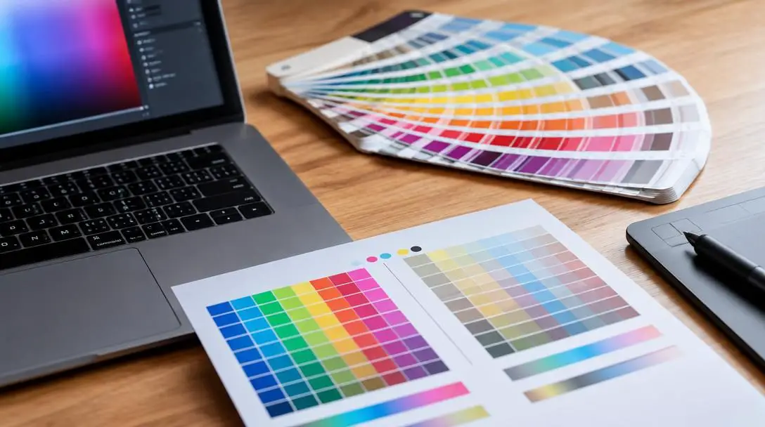
When cyan, magenta, and yellow pigments are deposited onto paper, they subtract various portions of the visual light spectrum. In pure color theory, combining saturated cyan, magenta, and yellow ink at full density ought to absorb all visible light and yield pitch black. In industrial practice, however, real-world chemical pigments suffer from chemical impurities; mixing cyan, magenta, and yellow results in an unappealing, muddy dark brown rather than a crisp black. To remedy this physical barrier, enhance tonal depth, and allow for crisp, cost-effective typography, commercial printing incorporates a fourth dedicated pigment: Key (black). When all four inks combine at full saturation, they deliver a rich, dense black.
Gamut mismatch: Why screen graphics shift on the printing press
The core challenge behind converting digital assets for physical manufacturing rests on the concept of color gamut. A color gamut represents the total boundary or spectrum of colors that a particular hardware device, digital space, or chemical process can reproduce. The RGB color space encompasses an expansive gamut, enabled by the luminous nature of digital screens. In contrast, the CMYK color space has a noticeably narrower gamut, bounded by the optical limitations of chemical dyes reacting on flat paper surfaces.
When a graphic designer converts an artwork file from RGB to CMYK, the conversion engine must translate a larger color spectrum into a much more restricted enclosure. While colors shared across both color spaces translate relatively seamlessly, shades that reside outside the printable CMYK envelope—known as out-of-gamut colors—cannot be manufactured using standard process inks. These unreachable hues frequently include blinding highlighter yellows, hyper-saturated cyan highlights, and fluorescent greens.
Translating an RGB file to CMYK forces mathematical algorithms to squeeze an expansive color universe into the physical boundaries of light-absorbing ink.
During the conversion routine, specialized color mapping algorithms calculate how to handle out-of-gamut pixels. The software pulls these unattainable RGB values inward to match the closest viable equivalent within the CMYK spectrum. This mathematical compression is the precise reason why graphics converted without oversight often appear dull, flat, or dramatically desaturated once transferred to a print workflow.
| Attribute | RGB Color Model | CMYK Color Model |
|---|---|---|
| Color Mechanism | Additive (combines light beams) | Subtractive (absorbs light wavelengths) |
| Primary Medium | Digital monitors, phones, televisions | Commercial presses, paper, physical packaging |
| Base State | Black (absence of emitted light) | White (unprinted reflective paper) |
| Maximum Saturation Result | Pure White | Rich Black (utilizing Key ink) |
| Relative Color Gamut | Broad gamut with high saturation | Narrower gamut bounded by physical chemistry |
Methods for converting digital assets to print specifications
Graphic and web designers rely on varied techniques to bridge the gap between digital coordinates and commercial ink formulas. The correct process depends primarily on whether the asset is a photographic raster file or an individual brand color formula.
Adobe Photoshop
For photographic imagery, complex raster graphics, layered digital compositions, and website layout exports, Adobe Photoshop represents the industry standard tool for managing color mode translations. The application carries robust color engines that display instantaneous visual feedback of gamut compression before files leave the studio.
- Open the original RGB master asset inside Adobe Photoshop.
- Select Image from the main application menu at the top of the interface.
- Hover over the Mode submenu to reveal the list of available color models.
- Click on CMYK Color from the available options.
- Review any system prompts regarding color profile assignments or layer flattening, selecting the option tailored to your packaging or print specifications.
- Choose Save As from the File menu and store the document under a distinct, print-specific filename to keep your master file unaltered.
Online conversion calculators
Web developers and interface designers frequently manipulate discrete color tokens, such as hexadecimal values or raw RGB coordinates in CSS stylesheets, rather than complex layered PSD files. When adapting an individual brand color for stationery, brand guidelines, or business card templates, launching heavy desktop editing software can be inefficient.

Dedicated online utilities, such as EasyRGB and RapidTables, allow designers to input exact numerical RGB values or hex codes directly into conversion fields. The web calculator processes the values and computes the corresponding CMYK percentages for Cyan, Magenta, Yellow, and Key. Designers can then transfer these calculated percentages directly into vector drawing software or desktop publishing suites. This ensures that vector logos, typographic treatments, and geometric brand elements are created directly with print-safe coordinates rather than relying on automated browser rendering.
Five frequent mistakes web designers make with physical print
Because digital workflows emphasize responsiveness, screen density, and pixel grids, designers accustomed to browser constraints frequently stumble over print production variables. Avoiding these common traps protects design teams from costly reprints and brand inconsistencies.
- Overwriting original digital files: Once a graphic document is converted into CMYK and saved directly over the source file, all discarded color information vanishes permanently. If marketing teams later require that asset for a responsive website, an app splash screen, or a video display, the lost brilliance cannot be reconstructed automatically.
- Trusting uncalibrated monitor previews: An image converted to CMYK and viewed on a backlit monitor is still being simulated through additive light. Ambient workplace lighting, panel backlighting, and lack of monitor calibration can create a false impression of vibrancy that ink on paper simply cannot deliver.
- Selecting hyper-saturated colors with no print equivalent: Digital artists often fall in love with radiant web colors that have no physical counterpart in four-color process printing. Establishing digital brand identities around out-of-gamut colors without testing corresponding print recipes creates persistent execution problems across offline marketing.
- Neglecting cross-channel brand consistency: Allowing one team member to rely on an automated file conversion while another picks CMYK swatches manually leads to divergent shades on company materials. Mismatched collateral weakens the visual authority of the organization.
- Ignoring the physical paper substrate: Unlike a uniform glass screen, paper comes in varying weights, textures, and coatings. The exact same CMYK percentage mix will print noticeably darker and softer on porous, uncoated stock than on smooth, glossy coated paper because uncoated sheets absorb ink into their fibers.
Strategic safeguards: Maintaining brand identity across marketing channels
When physical collateral like trade show flyers or custom presentation folders reach prospective clients, color discrepancies can undermine perceived professionalism. A customer holding a printed company brochure expects the corporate blue or energetic orange to reflect the exact identity they explored on their mobile screen. If the printed asset looks faded, murky, or shifted, brand credibility diminishes.
When a commercial printer receives an unadjusted RGB file, their internal Raster Image Processor (RIP) automatically translates the document into CMYK dots on the fly. Relying on an automated converter inside third-party printing equipment strips the designer of any control over how out-of-gamut values are compressed. A nuanced cobalt blue can drift into dull purple, while a bright citrus orange can degrade into a muddy brownish tone.
To retain creative authority over the final printed output, design teams should implement several advanced production safeguards:
- Dual-profile brand guidelines: Define both digital hex/RGB specifications and physical CMYK ink formulations from the earliest stages of brand development. Codifying these values in brand style guides eliminates guesswork for internal staff and outside agencies.
- Software soft proofing: Professional graphic applications provide soft-proofing preview modes that simulate ink absorption, black point compensation, and paper color on screen. Utilizing soft proofing helps designers foresee tonal flattening before files leave their workstations.
- Physical hard proofs: For mission-critical collateral, packaging runs, or substantial print volumes, always order a physical press proof from the manufacturing partner. Inspecting actual ink on paper under neutral daylight reveals subtle shifts that monitors hide.
- Specialty inks for out-of-gamut shades: When a corporate brand requires a hyper-vibrant hue that standard CMYK process inks cannot recreate, commercial printers can apply premixed spot inks, such as those within standardized color matching systems, to achieve exact fidelity on paper.
Frequently asked questions
Why do colors look vibrant on screen but dull when printed?
Screens generate light directly using the additive RGB model, producing intense, luminous hues across a broad color gamut. Printing relies on the subtractive CMYK model, where paper-bound pigments absorb light rather than emit it, naturally restricting the range and brilliance of reproducible colors.
What does the K in CMYK represent?
The K in CMYK stands for Key, which refers to black ink. In traditional commercial printing presses, the key plate carried the crucial detail lines, tonal depth, and contrast to which the other three colored ink plates were aligned.
Can I recover RGB color vibrancy if I accidentally overwrite my master file?
No. When an image is converted to CMYK and saved over the original file, the out-of-gamut color data is permanently removed. You cannot restore the original RGB color information automatically, which is why saving converted files under a separate name is essential.
What happens if I submit an RGB file directly to a commercial print shop?
The printing press software or Raster Image Processor will force an automated conversion from RGB to CMYK without your oversight. This automated translation frequently shifts critical colors, turning bright blues into purples or vibrant warm tones into muddy browns.
How does paper choice impact the final appearance of CMYK inks?
Paper substrates vary in their absorption rates and surface coatings. Glossy, coated papers hold ink dots cleanly on the surface for sharper, brighter reproduction, whereas uncoated, porous paper absorbs the ink deep into its fibers, causing colors to appear darker and less saturated.
The bottom line
Bridging the divide between digital screens and physical print requires recognizing that light and ink adhere to completely different physical rules. By respecting color gamut limitations, establishing separate master files, testing conversions through soft proofing, and codifying dual color standards across brand guidelines, web designers can ensure that their visual creations retain their intended punch, clarity, and authority across every medium.