The Art of Calligraphy: Creating Beautiful Handwritten Letters
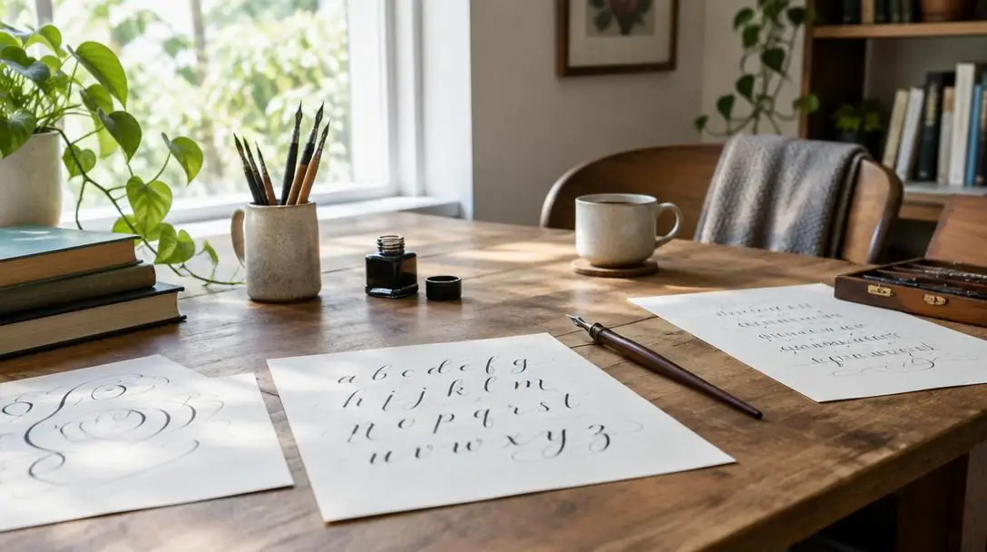
Calligraphy is the art of beautiful writing, representing a timeless medium of communication that has traversed continents and centuries. From the meditative brushwork of ancient China to the monastic scriptoria of medieval Europe and the thriving studios of modern lettering artists, the discipline continues to balance visual elegance with disciplined craftsmanship. While technology has transformed everyday communication into rapid, digital text, the essence of calligraphy remains unaltered: to craft deliberate, handwritten letterforms that carry human touch and artistic intention.
Beyond serving as an engaging and relaxing personal hobby, calligraphy functions as a valuable, versatile skill applicable to bespoke stationery, art prints, formal invitations, and creative design. Stepping into this craft connects practitioners to an enduring lineage of scribes and artisans. By understanding mechanical principles, honoring historical forms, and choosing the proper tools, anyone can transform individual pen strokes into expressive visual poetry.
Key takeaways
- Calligraphy is a disciplined, historical writing craft centered on the deliberate physical construction of letters rather than rapid cursive communication.
- Pen choice dictates line behavior: broad-edge nibs rely on stroke angles, pointed nibs produce contrast through downward pressure, and brush pens respond dynamically to wrist movement.
- Historical scripts range from the dense, architectural forms of medieval Gothic and early Christian Uncial to the flowing, looped flourishes of Copperplate and Spencerian.
- Proper ink and paper pairing prevents feathering, while light pencil guidelines are essential to preserving baseline consistency and balanced letter spacing.
The Historical Evolution of Lettering
To fully appreciate calligraphy today, it helps to explore how diverse cultures developed their own approaches to formal handwriting over the centuries. In ancient China, writing was revered as one of the highest artistic pursuits, standing alongside painting, philosophy, and poetry. The brush served as an organic extension of the writer's body, capturing every physical gesture, rhythmic shift, and subtle balance of weight directly onto paper or silk.
In the West, particularly across medieval Europe, formal script developed primarily within monastic scriptoria. Before the invention of the movable type printing press, monks and scribes worked by hand to preserve religious texts, legal archives, and classical literature. The physical nature of the materials directly dictated the shapes of the alphabets. Scribes cut quills and shaped metal-tipped instruments to write upon prepared animal skins or early artisanal papers, naturally creating structured, space-efficient hands designed for maximum legibility and economic use of expensive parchment.
Throughout history, the shapes of letters have been defined by the tactile relationship between the scribe's tool, the medium, and the writing surface.
As commercial trade expanded throughout the seventeenth, eighteenth, and nineteenth centuries, the demand for clear, rapid correspondence spurred the creation of flowing business hands. Modern calligraphy draws upon this rich evolution, synthesizing the exacting discipline of monastic and royal scribes with modern creative freedom.
Essential Tools and Materials
Beginning a calligraphy journey starts with selecting the right instruments. The market offers a wide variety of tools, and choosing the right pen depends entirely on the aesthetic you wish to achieve. Calligraphy pens fall into three main categories, each creating distinct visual contrasts.
Broad-Edge Nib Pens
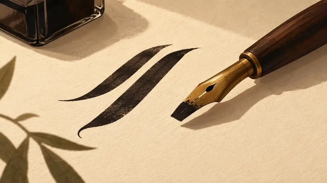
Broad-edge nib pens feature a flat, straight, or slightly chiseled edge. Rather than flexing under hand pressure, these nibs create natural contrasts between thick and thin strokes based purely on the angle at which the edge meets the paper and the direction of the stroke. Pulling the pen down with the full width of the edge creates a heavy ribbon of ink, while sliding it along the narrow corner produces razor-sharp hairlines. This mechanism is central to traditional medieval and Renaissance alphabets.
Pointed Nib Pens
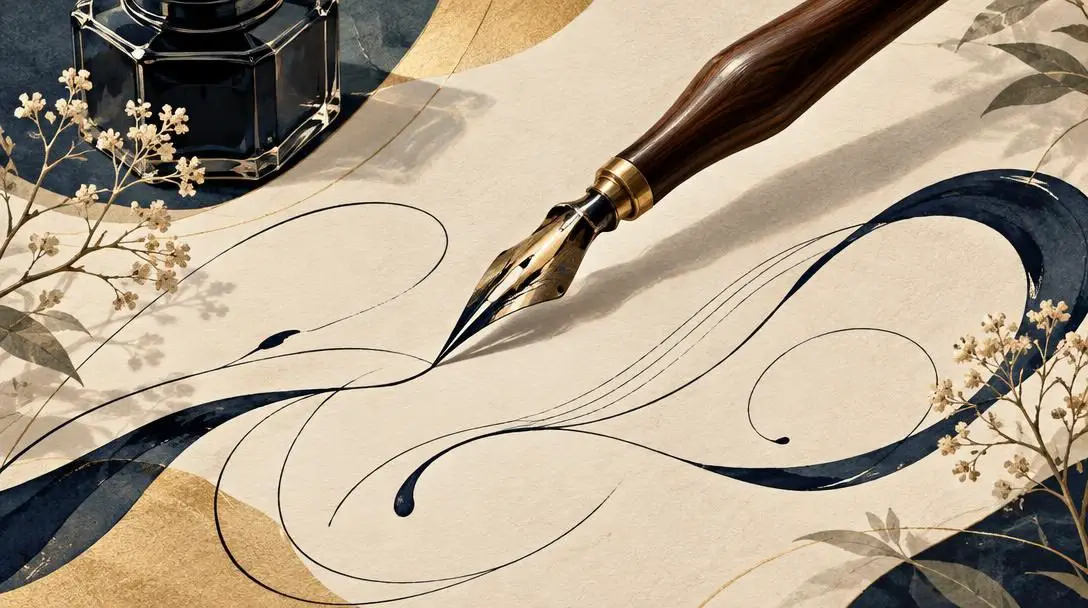
Pointed nib pens taper to a fine, sharp tip with flexible metal tines. Instead of depending on the pen's angle to vary line weight, pointed nibs respond to downward pressure. Pressing down splits the tines apart, allowing a wider flow of ink to pool onto the page and produce dramatic swell strokes. Releasing pressure brings the tines back together, leaving behind gossamer-fine upstrokes. This responsive flex makes pointed pens the premier choice for ornate, looping scripts.
Brush Pens
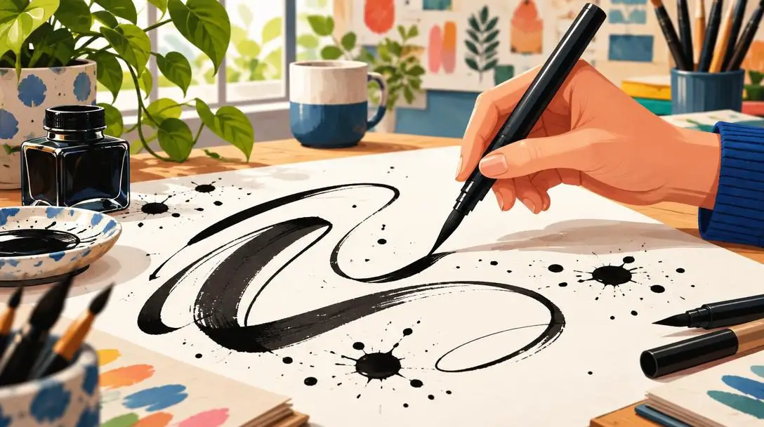
Equipped with a flexible fiber or bristle tip, brush pens provide an expressive, dynamic line that responds sensitively to pressure, writing speed, and wrist movement. They offer exceptional versatility, shifting seamlessly from delicate, painterly strokes to bold, saturated marks with a single flick of the hand. Because they carry internal reservoirs or cartridges, brush pens deliver the feel of traditional brush calligraphy with contemporary portability.
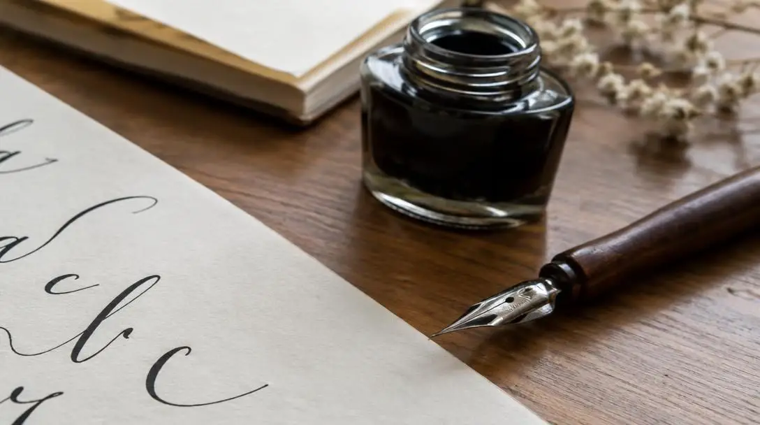
In addition to the pen, ink and paper play vital roles in the final outcome. Inks are available in bottled forms or pre-filled cartridges. Bottled inks allow for custom dipping, mixing, and dilution, whereas cartridges offer mess-free convenience for portable writing. Formulations vary from water-soluble varieties—which can be blended and washed for creative gradients—to water-resistant and waterproof formulas that will not bleed if exposed to moisture.
Choosing the correct paper is equally critical. Standard printer paper is porous and absorbs ink too rapidly, causing feathering where clean strokes fray into fuzzy edges. Calligraphers rely on smooth, resilient alternatives such as tracing paper, vellum paper, and archival acid-free paper. Smooth surfaces protect delicate nibs from snagging and ensure crisp line definition, while acid-free compositions prevent yellowing and degradation over time.
Auxiliary tools complete the workstation. A sturdy ruler is indispensable for drafting straight horizontal lines and consistent ascender guides. A clean eraser clears away preliminary graphite layouts once ink has dried. Many practitioners also rely on a lightbox, which shines illumination through opaque project paper to reveal underlying guide sheets, eliminating the need to draw and erase pencil lines on the final presentation surface.
Comparing Four Historic Calligraphy Styles
Historic styles reflect the distinct tools, cultures, and purposes of their respective eras. Mastering these scripts requires understanding their visual anatomy, structural rhythms, and historical origins.
| Style | Historical Origin | Primary Tool | Defining Visual Characteristics |
|---|---|---|---|
| Copperplate | England (16th Century) | Pointed nib | Flowing, curly letters with dramatic pressure-based thickness and precision loops |
| Spencerian | United States (19th Century) | Pointed nib | Curvy, open letterforms, delicate oval movements, and light, airy flourishes |
| Gothic | Central Europe (Middle Ages) | Broad-edge nib | Bold, dense, and angular letterforms with sharp breaks and architectural rigidity |
| Uncial | Early Christian Era | Broad-edge nib | Large, rounded, circular characters written entirely without lowercase letterforms |
Copperplate
Copperplate originated in England during the 16th century and remains one of the most recognized and celebrated pointed pen hands. Named after the engraved copper printing plates used to reproduce master handwriting manuals, this style is characterized by flowing and curly letters with rhythmic shifts between delicate hairline upstrokes and rich, shaded downstrokes. Copperplate requires strict discipline, maintaining a uniform slant, precise oval shapes, and consistent baseline contact throughout words.
Spencerian
Developed in the United States in the 19th century, Spencerian script emerged as a response to the need for clear, rapid, and elegant business writing. It is characterized by curvy letters and graceful, expansive loops. Compared to the heavy contrasts of Copperplate, Spencerian relies on lighter pressure transitions, generous counter-spaces, and open, sweeping curves that allow for fast, fluid hand movements across ledgers and formal correspondence.
Gothic
Gothic, also widely recognized as Blackletter, developed in medieval Europe and achieved widespread prominence in Germany and Central Europe. Designed to fit large amounts of sacred text onto expensive vellum pages, Gothic script is bold and intensely angular. Written with a broad-edge pen held at a steady angle, it features dense, upright vertical strokes, sharp terminal breaks, and minimal white space between characters, creating a majestic, fabric-like texture across the page.
Uncial
Uncial is an ancient script developed during the early Christian era, long before the modern distinction between uppercase and lowercase letters existed. Characterized by its large, circular letters and lack of lowercase letters, Uncial utilizes a single, unified alphabet of rounded shapes. Scribes crafted its distinctive forms with broad-edge tools, resulting in a dignified, historic hand frequently employed today for ceremonial certificates, formal manuscript headers, and striking titles.
The Mechanics of Stroke, Weight, and Spacing
Every hand-lettered alphabet is constructed from a foundation of deliberate physical strokes. Unlike casual handwriting, which favors speed and convenience, calligraphy is an exercise in structural precision. Creating a consistent and even stroke weight across an entire composition requires acute physical awareness and steady motor control.
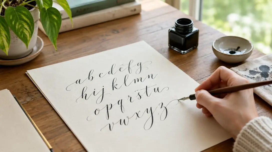
When working with pointed pens, line variation is controlled through calculated changes in pen pressure. Applying even downward pressure causes the metal tines to part, releasing a controlled flow of ink for shaded stems. As the stroke transitions upward, pressure must be completely released, allowing only the micro-fine tip to skim the paper surface. In broad-edge styles, contrast depends entirely on the fixed relationship between the flat pen edge and the horizontal baseline rather than pressure variation.
Letter spacing is equally critical to overall legibility. Calligraphers focus not only on ink strokes, but also on the counter-space—the interior white space trapped inside letters—and the intervals between neighboring characters. Uneven spacing creates jarring visual gaps or crowded clusters that disrupt the reader's eye. Drafting light pencil lines for the baseline (the line on which letters sit) and the waistline (the height of letter bodies) ensures consistent scale, ascenders, and descenders.
Step-by-Step Practice Routine for Beginners
Developing dependable muscle memory requires methodical, structured repetition. Beginners can build confidence and refine line quality by following a disciplined seven-step practice framework.
- Prepare your workspace and materials: Clear a flat, sturdy desk with good lighting. Arrange smooth practice paper, ensure your ink is properly mixed, and have your ruler, pencil, and chosen pen within easy reach.
- Draw accurate pencil guidelines: Using your ruler, draft light, parallel baseline and waistline guidelines. Establishing these visual boundaries keeps your letters from shrinking, expanding, or wandering across the page.
- Warm up with fundamental strokes: Before writing actual letters, spend ten minutes practicing basic lines. Draw repeating vertical downstrokes, hair-thin upstrokes, controlled curves, and uniform ovals to calibrate pen pressure and angle.
- Repeat individual letters by shape family: Group letters that share anatomical features, such as round letters (o, c, e) or straight-stemmed letters (i, l, t). Repeat each individual letter across a line until its proportion and weight become second nature.
- Assemble letters into words: Combine practiced characters into short, simple words. Shift your focus toward harmonious letter spacing, ensuring the negative space between characters remains visually uniform.
- Experiment with tools and angles: Dedicate a portion of each session to testing how subtle shifts in pen grip, edge angle, and downward pressure alter line definition and ink delivery.
- Maintain regular, focused practice sessions: Short, consistent daily practice sessions of fifteen to thirty minutes develop coordination and muscle memory far more effectively than sporadic multi-hour marathons.
Common Mistakes to Avoid
Because calligraphy is a mechanical skill demanding hand-eye coordination, beginner calligraphers frequently run into predictable pitfalls. Recognizing these common errors helps you correct them before they turn into stubborn habits.
- Skipping the guidelines: Writing freehand on blank paper almost always results in wavering baselines, erratic letter heights, and inconsistent slant angles.
- Gripping the pen too tightly: Excessive tension in the fingers cramps the hand and produces rigid, trembling lines. Smooth calligraphy flows from relaxed movements originating in the wrist, forearm, and shoulder.
- Mismatching wet inks with low-grade paper: Pairing high-flow fountain or dip inks with standard porous paper causes ink bleeding and feathering, obliterating sharp stroke contrast.
- Rushing through strokes: Moving too fast prevents pointed nibs from expanding smoothly and causes broad nibs to lose solid contact, leading to skipped strokes and pooling.
- Ignoring internal counter-spaces: Inconsistent interior spaces warp letter anatomy, making the final text look uneven even if the exterior strokes align.
- Erasing pencil lines prematurely: Using an eraser while ink is even slightly damp smears fine hairlines and ruins hours of careful work.
Designing Bespoke Projects and Personal Keepsakes
Once you develop steady control over basic letterforms, calligraphy opens endless possibilities for bespoke stationery, signage, and display art. Hand-lettered envelopes, personalized invitations, poetry prints, and wedding stationery carry a tactile warmth and authenticity that printed commercial type cannot match.
A rewarding creative strategy is combining distinct calligraphy styles within a single piece to establish visual hierarchy. For example, pairing the bold, architectural drama of a Gothic title with the light, airy loops of Spencerian or the stately curves of Copperplate text beneath creates an eye-catching contrast. This technique guides the viewer's eye through the composition, balancing structural weight with delicate filigree.
You can further elevate your work into a cherished keepsake by incorporating personalized decorative touches. Framing a quotation with an intricate geometric or floral border establishes clear boundaries, while adding delicate wafer paper flowers brings subtle three-dimensional artistry to announcements and gift certificates. As you advance, exploring metallic gouache, genuine vellum, and archival framing techniques ensures your handcrafted work retains its beauty for generations.
Frequently asked questions
What is the main difference between broad-edge and pointed nib pens?
A broad-edge pen has a flat, chiseled tip that creates thick and thin lines based on the angle and direction of the stroke. A pointed nib has a sharp, flexible tip that creates line variations through downward pressure, which parts the tines to release more ink.
Why does standard printer paper cause problems for calligraphy?
Standard printer paper is highly absorbent and porous. When exposed to liquid calligraphy ink, it pulls the ink outward across paper fibers, leading to feathering and bleed-through that ruin clean, sharp stroke edges.
How do Copperplate and Spencerian scripts differ from one another?
While both are flowing styles written with pointed pens, Copperplate features heavier, highly structured pressure shading and tight, uniform loops. Spencerian, developed in 19th-century America, uses lighter pressure contrasts, open ovals, and sweeping flourishes designed for faster, graceful business writing.
What role does a lightbox play in the lettering process?
A lightbox illuminates guide sheets from behind your final paper. This allows you to follow straight lines and layout margins without having to draw and subsequently erase pencil guidelines on delicate or expensive presentation paper.
Does the Uncial calligraphy style include lowercase letters?
No. Uncial was developed during the early Christian era before lowercase alphabets (minuscules) were developed. It consists of a single alphabet of stately, rounded majuscule letterforms.
The bottom line
Calligraphy is far more than decorative handwriting; it is a mindful, rewarding craft that balances artistic expression with centuries of disciplined tradition. By choosing the right combination of nib, ink, and paper, drafting careful guidelines, and practicing fundamental strokes, anyone can master this expressive art form. Whether you are addressing wedding invitations, designing custom posters, or simply seeking a meditative creative outlet, learning calligraphy allows your hand to produce enduring beauty, one stroke at a time.