The Art of Color Analysis: 5 Tips For Excellent Style

Many shoppers know the frustration of spotting a striking garment on a store hanger, only to find that it leaves them looking washed out, tired, or sallow the moment they put it on. This common styling dilemma rarely stems from the cut or tailoring of the clothing; instead, it is almost always an issue of color interaction. Color analysis is the practice of evaluating how different shades interact with your natural skin tone, eye color, and hair color to identify the specific hues that bring out your best features. Rather than leaving shopping decisions to guesswork or passing fads, analyzing your personal coloring provides an objective foundation for curating an authentic, flattering wardrobe.
Every textile you wear reflects ambient light directly back onto your face, casting subtle tints that can either illuminate your complexion or emphasize under-eye circles and blemishes. By understanding color theory—specifically how temperature, value, and saturation relate to your natural coloring—you can make deliberate choices that simplify getting dressed each morning. Applying the fundamentals of color analysis eliminates closet fatigue, prevents costly impulse purchases, and ensures that every piece you own works in harmony with your natural beauty.
Key takeaways
- Skin undertones remain constant throughout your life and dictate whether warm, cool, or neutral hues flatter your complexion best.
- Establishing a defined color palette creates an intentional framework that allows different pieces in your wardrobe to coordinate seamlessly.
- Combining complementary or analogous colors alongside grounding neutrals generates visual harmony without overwhelming your appearance.
- Varying the lightness and saturation of a single hue through shades and tones adds sophisticated dimension to simple monochromatic outfits.
The foundational mechanics of color analysis
Color analysis is rooted in the science of optics and color theory. The human eye perceives color contextually, meaning that two hues placed side by side dramatically influence how each is seen. When you drape a fabric around your shoulders, the light reflecting off the textile casts a faint secondary wash over your jawline, cheeks, and eyes. If the characteristics of the fabric clash with your biological pigments, the optical conflict draws attention to skin imperfections, makes the complexion appear sallow or gray, and distracts from your facial features.
To master this interaction, stylists evaluate colors across three primary properties: temperature (warm versus cool), value (light versus dark), and saturation (bright and clear versus soft and muted). When the clothes you wear share the baseline properties of your natural coloring, the human eye registers a cohesive, balanced image. Harmonizing your clothing with your natural traits produces an instant brightening effect, evening out skin tone and giving the eyes a vivid, refreshed appearance.
Harmonious colors minimize imperfections and even out skin redness, while disjointed shades exaggerate under-eye shadows and drain natural radiance.
Five core tips for mastering personal color analysis
Applying color analysis to your daily routine does not require an art degree or a complete closet overhaul. By focusing on five essential styling principles, you can systematically identify the hues that elevate your presentation and weed out the items that detract from your appearance.
Tip 1: Understand your skin undertones
The cornerstone of color analysis is identifying your skin undertones. While your surface skin tone can shift throughout the year due to sun exposure, skin irritation, or aging, your undertone remains entirely stable beneath the surface. Undertones are generally divided into three categories: warm, cool, and neutral. Recognizing where your skin sits along this spectrum clarifies which color families will naturally highlight your complexion.
Individuals with warm undertones carry golden, peachy, or yellow pigments beneath the skin. These complexions look luminous when paired with earthy tones like rich browns, warm oranges, mustard yellows, and terracotta. In contrast, cool undertones feature hints of pink, red, or blue. Cool-toned individuals shine brightest in jewel-like or crisp hues such as cobalt blues, emerald greens, and rich purples. Neutral undertones contain a balanced blend of warm and cool pigments, providing the versatility to wear shades from both sides of the color wheel.
| Undertone Category | Subsurface Pigment | Most Flattering Garment Colors | Visual Effect on Complexion |
|---|---|---|---|
| Warm | Golden, peachy, or yellow | Rich browns, oranges, yellows, and warm earthy tones | Accentuates natural golden warmth and minimizes dullness |
| Cool | Pink, red, or subtle blue | Blues, greens, purples, and crisp jewel tones | Evens out facial redness and brightens the eye area |
| Neutral | Balanced blend of warm and cool | A broad mix of warm earth tones and cool oceanic hues | Provides flexibility across both cool and warm palettes |
Tip 2: Determine your color palette
Once you have identified your underlying temperature, the next step is building a structured color palette. A color palette is a carefully curated group of hues designed to complement your features while coordinating effortlessly with one another. Establishing this framework prevents random, disjointed purchases and transforms your closet into a cohesive collection where separate pieces mix and match naturally.
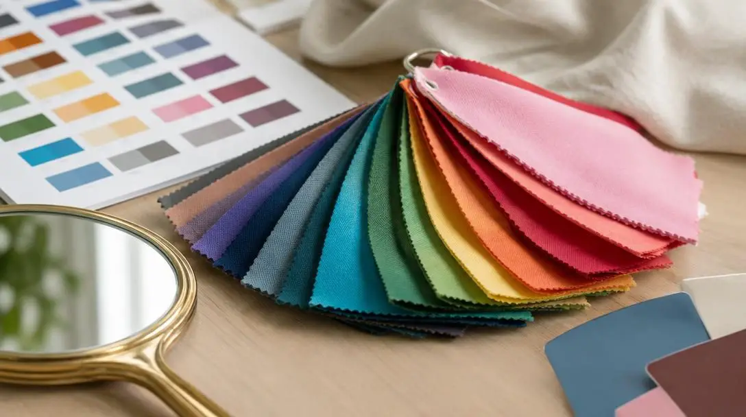
Wardrobe palettes generally center around three main options:
- Warm color palettes: Collections dominated by rich, fiery, and organic pigments like rust, olive green, warm camel, deep mustard, and coral.
- Cool color palettes: Assortments focused on crisp, tranquil shades such as navy, icy lavender, spruce green, berry, and true blue.
- Neutral color palettes: Versatile foundations composed of black, crisp white, charcoal, soft gray, and beige that anchor bolder statement colors.
Selecting a primary palette that aligns with your undertone saves considerable time and money. When all of your core garments share a compatible baseline, putting together stylish, balanced outfits becomes nearly effortless.
Tip 3: Mix and match colors effectively
Many people default to wearing exclusively dark or neutral garments simply because combining distinct colors feels intimidating. However, learning the basics of color harmony allows you to combine multiple hues with confidence. Utilizing the standard color wheel provides two reliable strategies for pairing items in your closet:
- Complementary colors: These are hues situated directly opposite each other on the color wheel, such as blue paired with orange, or red paired with green. Because complementary pairings offer maximum contrast, they create an energetic, visually striking dynamic that makes statement pieces stand out.
- Analogous colors: These are shades positioned side by side on the color wheel, such as blue and green, or red and orange. Analogous color schemes offer a gentle, fluid transition that appears calm, elegant, and naturally cohesive.
To keep multi-colored pairings from looking chaotic, always integrate neutral foundations. Anchoring an analogous or complementary combination with neutral garments—such as a tailored gray blazer or white trousers—balances the outfit and allows the focal colors to shine.
Tip 4: Experiment with different shades and tones
Sticking to your ideal color palette does not mean you must wear the brightest, purest saturation of every hue. In color theory, shades and tones represent the lightness, darkness, or muting of a base color. A shade is created by deepening a hue with black, while a tone is formed by softening a color with gray. For instance, while light pink is a delicate tint of pink, dusty rose represents a muted tone of the same family.
Playing with variations within a single color family allows you to build depth and contrast without introducing competing hues. A classic example of this technique is tonal dressing: pairing a light blue silk shirt with dark blue denim creates an understated, sophisticated contrast. By relying on tonal variation rather than stark color clashes, your outfit gains architectural interest while maintaining a clean, cohesive look.
Tip 5: Consider your personal style and lifestyle
While color analysis offers reliable guidelines, fashion remains an expression of individuality. The shades you wear must reflect your authentic personality and support your daily routine. If a color flatters your skin under salon lights but feels unnatural or uncomfortable to wear, it will likely spend its life hanging unworn in your closet.
Consider how your innate temperament influences your preferences. If you have a bold, expressive personality, you will likely feel energized wearing high-contrast complementary combinations and vibrant statement colors. Conversely, if you prefer an understated, quiet aesthetic, your wardrobe will feel more authentic centered around muted tones and calming neutrals.

Furthermore, your daily schedule dictates your wardrobe requirements. An executive navigating formal corporate settings, a creative professional working in a casual studio, or a parent managing an active household will each need distinct, practical color strategies. Factoring your lifestyle into your palette ensures your style remains functional, durable, and comfortable.
How to conduct a personal fabric test at home
You do not need specialized studio equipment to evaluate your coloring. By following a structured self-assessment in natural lighting, you can discover your ideal hues using items already in your home.
- Examine your natural features in clear daylight: Stand in front of a mirror positioned near a window that receives bright, indirect sunlight. Avoid artificial yellow bulbs or harsh fluorescent tubes, which distort the true colors of your skin, hair, and eyes.
- Perform a fabric draping test: Collect solid-colored fabrics, towels, or garments representing distinct temperatures. Select earthy shades like camel, rust, and mustard alongside cool shades like navy, emerald, and berry. Drape each item closely beneath your chin while observing your face in the mirror.
- Identify facial reactions: Note how your complexion responds to each fabric. Flattering colors will make your skin look smooth, even out redness, and brighten the whites of your eyes. Unflattering hues will exaggerate under-eye shadows, emphasize blemishes, or cast a yellowish or gray tint onto your skin.
- Classify your baseline temperature: Based on the draping results, identify whether your features harmonize best with warm earth tones, cool oceanic shades, or a balanced neutral mix. Use this result to establish your personal color palette.
- Audit your closet: Sift through your current clothing and group items by color family. Keep the garments that flatter your baseline temperature within easy reach, and evaluate whether washed-out pieces can be salvaged through strategic layering or neutral balancing.
Frequent color selection mistakes to avoid
Even when individuals grasp the basic principles of color matching, styling errors can easily creep into daily choices. Being mindful of these widespread pitfalls will keep your closet intentional and flattering:
- Confusing surface tone with undertone: Assuming that fair skin always means cool undertones, or that olive and deep complexions are strictly warm, is a frequent error. Surface redness, freckles, and suntans do not alter the underlying pigment temperature beneath your skin.
- Chasing seasonal color trends blindly: Fashion retailers introduce new "it" colors every season. Purchasing garments solely because a hue is trending often results in a closet filled with mismatched pieces that drain your natural coloring.
- Over-relying on dark neutrals: Defaulting to black or charcoal gray out of habit can wash out softer complexions. While neutrals are indispensable for grounding bold pairings, they should support your natural palette rather than replace it entirely.
- Dressing in flat, single tones: Wearing a single hue without variation in lightness or texture produces an uninspired, flat presentation. Introducing diverse shades, tones, and finishes brings essential depth to an ensemble.
- Ignoring functional lifestyle demands: Curating a delicate, pastel-heavy wardrobe when your daily environment requires practical, durable clothing leads to frustration and garment neglect.
Long-term wardrobe integration and next steps
Mastering color analysis is an ongoing refinement rather than an overnight overhaul. Once you have identified your primary color palette and practiced building balanced outfits with complementary and analogous schemes, you can explore more nuanced styling factors, such as fabric texture.
The texture of a textile changes how it absorbs and reflects light, directly influencing the appearance of its color. Matte fabrics, like wool or brushed cotton, diffuse light and give shades a grounded, understated feel. In contrast, lustrous fabrics, like silk, satin, or polished leather, reflect light intensely, making colors appear more vibrant and saturated. Paying attention to these surface qualities enables you to fine-tune how different tones look against your skin.
Additionally, you can extend your palette beyond apparel to accessories, makeup, and jewelry. Cool-toned individuals often find that silver, platinum, and white gold echo their natural traits, while warm-toned individuals pair naturally with yellow gold, brass, and copper. Coordinating your eyewear, scarves, handbags, and lip colors ensures that every finishing accent reinforces your overall visual harmony.
Frequently asked questions
How do I know if my skin undertone is warm, cool, or neutral?
You can identify your undertone by observing your natural pigment in bright, indirect daylight. Warm undertones carry subtle peach, yellow, or golden pigments that look radiant against earthy browns and oranges. Cool undertones feature pink, red, or bluish hints that pair best with jewel blues and purples. If your skin easily harmonizes with both warm and cool hues without clashing, you likely have a neutral undertone.
Can getting a deep suntan change my skin undertone?
No, tanning alters only your surface skin tone, not your undertone. While prolonged sun exposure increases melanin and temporarily darkens your outward complexion, the fundamental temperature beneath your skin remains constant throughout your life.
What is the difference between complementary and analogous color schemes?
Complementary colors sit opposite each other on the color wheel, such as blue and orange, creating an energetic and high-contrast appearance. Analogous colors sit directly adjacent to one another on the wheel, such as blue and green, producing a gentle, cohesive, and harmonious transition across your outfit.
Does having a dedicated color palette restrict what I can wear?
A color palette does not limit your style; instead, it provides a curated framework that ensures your clothing coordinates effortlessly. Within your palette, you can explore countless shades, tones, and saturations, expanding your wardrobe's versatility rather than restricting it.
How should neutral colors be used alongside bold shades?
Neutral colors like black, white, gray, and beige serve as grounding anchors in an outfit. Pairing a neutral foundational piece, such as trousers or a jacket, with vivid complementary or analogous colors balances the visual weight of your clothing and prevents bright statement pieces from overwhelming your natural features.
The bottom line
Color analysis is not a rigid collection of restrictive fashion rules; it is an empowering styling tool designed to help you understand your unique visual baseline. By identifying your skin undertones, establishing a harmonious palette, and thoughtfully balancing tones and neutrals, you can build an authentic, hardworking wardrobe that makes dressing simple, expressive, and undeniably flattering every single day.