
5 Best Metal Album Covers
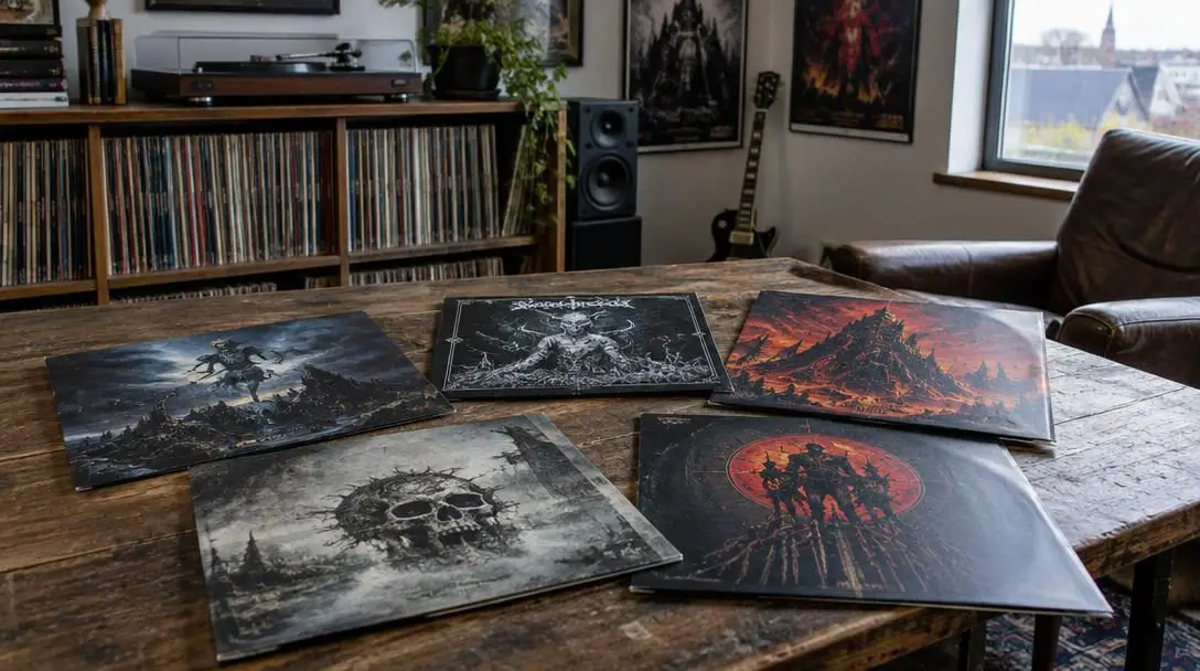
In the expansive universe of heavy metal, album packaging has always served a much greater purpose than functioning as a protective cardboard sleeve for a vinyl record or compact disc. Heavy metal has continuously differentiated itself from other contemporary genres through an unyielding commitment to epic storytelling, philosophical critiques, and overarching conceptual narratives. When a band conceives a record around intricate lyrical lore or classic literature, the visual artwork on the front jacket acts as an immediate aesthetic threshold, offering listeners an instant glimpse into the sonic universe waiting inside.
From the mid-1970s through the modern era, legendary musicians have joined forces with visionary painters and illustrators to create covers that transcend mere marketing materials. Several landmark albums have etched themselves into music history not just for their sonic power, but for their instantly recognizable visual identities. Releases by Judas Priest, Megadeth, Metallica, Dio, and Mastodon showcase how thoughtful visual execution elevates a heavy metal recording into an enduring cultural monument.
Key takeaways
- Heavy metal album sleeves function as conceptual gateways that visually translate intricate lyrical lore, philosophical themes, and literary adaptations.
- Recurring mascots such as Megadeth's Vic Rattlehead and Dio's Murray anchor a band's brand identity across different artistic narratives.
- Many iconic retail sleeves showcase only a cropped portion of a much larger, expansive fine art canvas.
- Legendary covers typically stem from collaborative partnerships between bands conceptualizing the core message and professional illustrators bringing it to life on canvas.
At a glance: Five landmark heavy metal covers
| Rank | Album Title | Band | Release Year | Cover Artist | Visual Theme or Mascot |
|---|---|---|---|---|---|
| 5 | Leviathan | Mastodon | 2004 | Paul Romano | Maritime literary epic (Moby Dick) |
| 4 | Sad Wings of Destiny | Judas Priest | 1976 | Patrick Woodroffe | Fallen Angel with band symbol |
| 3 | Peace Sells…But Who’s Buying? | Megadeth | 1985 | Ed Repka | Vic Rattlehead at damaged United Nations |
| 2 | Master of Puppets | Metallica | 1986 | Don Brautigam | Graveyard crosses controlled by strings |
| 1 | Holy Diver | Dio | 1983 | Randy Berrett | Murray subduing a priest at sea |
The five most iconic heavy metal album covers
Leviathan by Mastodon

- Release year: 2004
- Cover artist: Paul Romano
- Thematic basis: Herman Melville's novel Moby Dick
- Key tracks: Iron Tusk, I Am Ahab
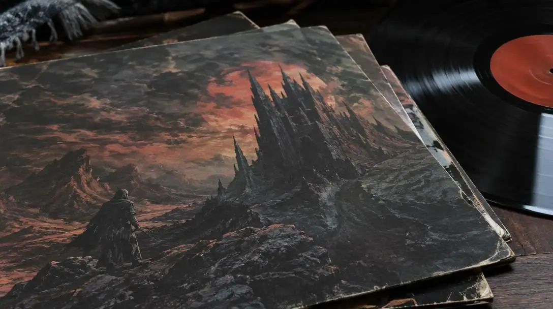
Arriving in 2004, Mastodon created the most contemporary entry on this list with their second studio album, Leviathan. The record is an ambitious concept album built directly around Herman Melville's classic maritime novel Moby Dick, featuring narratively charged songs such as "Iron Tusk" and "I Am Ahab." To realize the massive scale of the music visually, the group enlisted Philadelphia artist Paul Romano, who had already built an extensive reputation designing dynamic artwork across the music industry.
Romano crafted an intricate, sweeping visual painting that captures an epic clash of colors and dynamic movement, evoking the atmosphere of a classic fantasy illustration. What makes the final retail packaging particularly interesting is that it displays only a cropped segment of Romano's broader composition. The visible portion frames the tumultuous maritime confrontation, underscoring the raw elemental power and literary weight that defines Mastodon's modern metal landmark.
Sad Wings of Destiny by Judas Priest
- Release year: 1976
- Cover artist: Patrick Woodroffe
- Painting title: Fallen Angel
- Key tracks: The Ripper, Deceiver
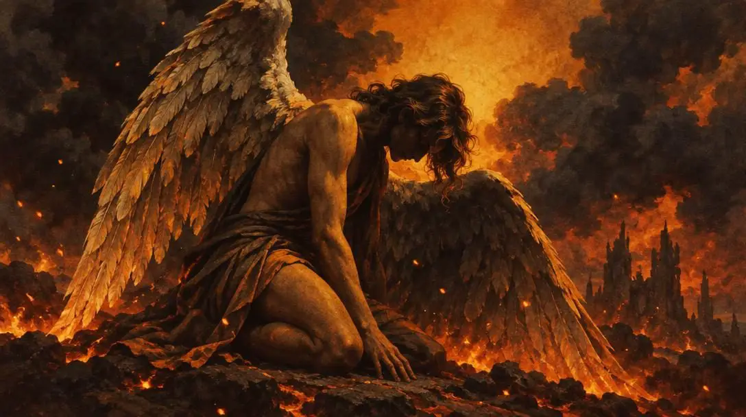
Released in 1976 as Judas Priest's sophomore album, Sad Wings of Destiny arrived during the formative years of traditional heavy metal. The record delivered a versatile palette of sounds, from the theatrical darkness of "The Ripper" to the driving melodic energy of "Deceiver," establishing the group as a pioneering force in the genre. To capture this distinct emotional range, the band selected fantasy artist Patrick Woodroffe to produce the sleeve art.
Woodroffe titled the finished painting "Fallen Angel." The artwork portrays a sorrowful celestial figure surrounded by flames, deliberately incorporating Judas Priest's distinctive three-pronged insignia into the scene. While Woodroffe would go on to craft covers for a broad spectrum of artists including Budgie, Mike Batt, and electronic producer Tiësto, his striking visual for Judas Priest remains his most celebrated and enduring contribution to rock history.
Peace Sells…But Who’s Buying? by Megadeth

- Release year: 1985
- Cover artist: Ed Repka
- Visual centerpiece: Vic Rattlehead
- Key tracks: Wake Up Dead, The Conjuring
Capitalizing on the raw momentum of their debut release, Killing Is My Business...and Business Is Good!, Megadeth unleashed Peace Sells...But Who's Buying? the following year in 1985. The record delivered searing thrash metal anthems like "Wake Up Dead," "The Conjuring," and its iconic title track, propelling the band to mainstream commercial visibility. The sleeve artwork played an equally pivotal role in cementing the group's rebellious public image.
Illustrated by artist Ed Repka, the cover established Megadeth's skeletal mascot, Vic Rattlehead, as a permanent cultural fixture. Repka rendered Vic in a sharply tailored suit leaning against a "For Sale" sign in front of the smoking ruins of the United Nations headquarters. Repka later noted that this project was a defining milestone in his career, establishing a long-term partnership that saw him produce artwork for subsequent Megadeth titles, including "Hangar 18," "No More Mr. Nice Guy," and "From Beyond."
Master of Puppets by Metallica
- Release year: 1986
- Cover artist: Don Brautigam
- Conceptual designers: Metallica and Peter Mensch
- Key tracks: Battery, Disposable Heroes, Welcome Home
Widely considered by critics and audiences alike to be Metallica's crowning achievement, 1986's Master of Puppets earned near-universal acclaim through landmark compositions such as "Battery," "Disposable Heroes," and "Welcome Home." The record tackles complex themes of institutional power, involuntary subjugation, drug addiction, and the brutal waste of warfare, demanding an album cover that could match its profound thematic weight.
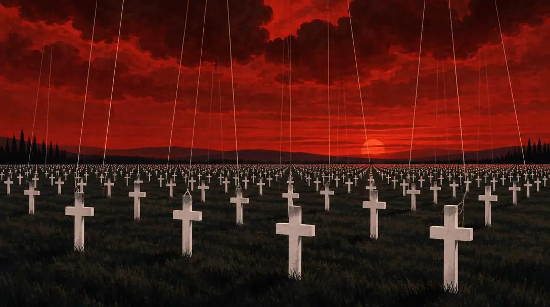
The visual concept originated with the band members themselves, who subsequently worked with manager Peter Mensch and painter Don Brautigam to bring the idea to completion. Brautigam illustrated a haunting, blood-red evening sky towering over an endless field of white cemetery crosses, with strings descending from the sky to manipulate the markers like puppets. The imagery serves as a direct visual metaphor for unseen powers controlling human lives and discarding soldiers in battle, turning the record into an instant visual classic.
The visual presentation on the sleeve must serve as an immediate gateway into the sonic universe waiting inside.
Holy Diver by Dio
- Release year: 1983
- Cover artist: Randy Berrett
- Visual centerpiece: Murray the mascot
- Key tracks: Stand Up and Shout, Rainbow in the Dark
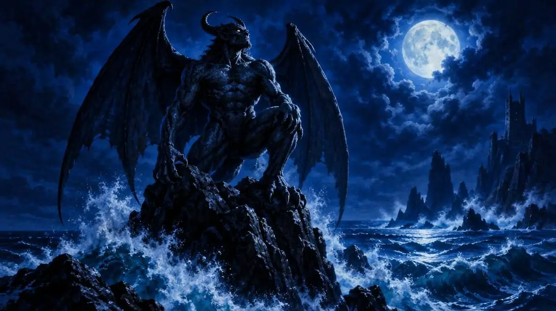
After finishing his historic initial run as lead vocalist for Black Sabbath, Ronnie James Dio formed his self-titled band alongside familiar collaborators. The group's 1983 debut effort, Holy Diver, introduced heavy metal audiences to timeless standards, including "Stand Up and Shout," "Rainbow in the Dark," and the mythic title track. To visually anchor the band's identity, Dio introduced an imposing mascot named Murray, who would feature prominently across future projects.
Painter Randy Berrett was commissioned to illustrate Murray for the front jacket. Berrett's composition depicts the massive horned figure standing atop a cliff overlooking a violent, churning ocean while holding a chain that binds a drowning priest. The provocative scenario generated significant controversy among conservative commentators upon release, but its dramatic staging and dark fantasy aesthetic perfectly complemented Dio's theatrical, larger-than-life musical style.
The artistic mechanics behind heavy metal visual design
The visual impact of classic heavy metal packaging relies on intentional storytelling techniques rather than simple decorative design. Where other genres frequently gravitate toward minimalist photography or abstract typography, heavy metal employs representational fine art and layered symbolism. A closer examination reveals four primary design mechanisms that make these works effective:
- Mascots as brand continuity: Visual icons such as Megadeth's Vic Rattlehead and Dio's Murray function as recurring narrative anchors. By inserting a consistent character into different political or mythical scenarios, a band maintains recognizable branding while exploring new conceptual territory.
- Visual metaphor and social commentary: Covers like Master of Puppets turn abstract issues into concrete environments. By rendering military cemetery markers connected to strings controlled from the heavens, Don Brautigam transformed systemic manipulation into an unmistakable physical landscape.
- Literary and conceptual translation: When adapting classic literature, as Mastodon did with Moby Dick on Leviathan, visual artists must bridge the gap between historic literature and modern sound. Paul Romano used rich palette contrasts and turbulent brushwork to mirror the nautical fury of Herman Melville's prose.
- Symbolic integration: Integrating a band's physical insignia directly into an oil painting, as seen on Judas Priest's Sad Wings of Destiny, links commercial branding with fine art. Patrick Woodroffe seamlessly embedded the group's three-pronged symbol into the pendant worn by the central figure.
How to study and collect heavy metal cover art
For music collectors, graphic artists, and heavy metal enthusiasts who wish to analyze these cultural artifacts more deeply, physical formats offer insights that compressed digital streaming thumbnails simply cannot replicate.
- Acquire full-sized physical formats: Inspect original 12-inch vinyl sleeves or high-resolution packaging booklets. The physical dimensions allow you to examine the brush strokes of painters like Patrick Woodroffe and Ed Repka that are lost when scaled down to a small phone screen.
- Seek out uncropped artist canvases: Research the original, full-scale paintings produced by the artists. As demonstrated by Paul Romano's work for Mastodon, packaging designers frequently crop paintings to fit square specifications, hiding expansive background details and compositional balance.
- Explore the illustrator's broader portfolio: Track the careers of the painters behind your favorite covers. Following Patrick Woodroffe's work through projects for Mike Batt, Budgie, and Tiësto, or exploring Ed Repka's contributions to titles like "Hangar 18" and "From Beyond," provides a richer historical understanding of fantasy and thrash aesthetics.
- Analyze track listings alongside visual framing: Listen to the album while actively observing the cover art. Compare specific tracks, such as Mastodon's "Iron Tusk" or Judas Priest's "The Ripper," against the visual themes of maritime peril or fallen divinity to see how the band and artist synchronized their creative ideas.
Common pitfalls when analyzing metal artwork
Because the history of heavy metal album production is surrounded by urban legends and casual assumptions, listeners often misunderstand how these classic sleeves were conceived and executed.
- Assuming musicians painted the covers themselves: Although band members routinely generate the overarching visual concept, professional fine artists are hired to bring those ideas to fruition. Metallica formulated the field-of-crosses concept for Master of Puppets, but painter Don Brautigam and manager Peter Mensch executed the finished canvas.
- Overlooking mascot continuity across albums: Casual listeners frequently view figures on covers as one-off illustrations rather than recurring universe-building. Vic Rattlehead is not an isolated subject on Peace Sells...But Who's Buying?; he represents an enduring persona central to Megadeth's visual legacy.
- Ignoring the historical context of the band: It is easy to view these masterpieces outside of their timeline. Judas Priest was only on their second album when Sad Wings of Destiny came out in 1976, while Dio's Holy Diver served as a crucial professional reinvention immediately following Ronnie James Dio's departure from Black Sabbath.
Frequently asked questions
Who painted the cover of Metallica's Master of Puppets?
The cover was painted by professional artist Don Brautigam. The foundational visual concept was conceived directly by the members of Metallica, who coordinated with manager Peter Mensch to see the piece fully realized on canvas.
What is the official title of the artwork on Judas Priest's Sad Wings of Destiny?
The original painting by Patrick Woodroffe is titled "Fallen Angel." The artwork features a winged celestial figure surrounded by flames and intentionally integrates Judas Priest's signature symbol into the visual composition.
Is the entire painting shown on the front of Mastodon's Leviathan?
No. The retail sleeve for Mastodon's 2004 album displays only a small, cropped portion of the expansive painting created by Philadelphia artist Paul Romano.
What is the name of the mascot featured on Dio's Holy Diver cover?
The mascot depicted on the cover of Dio's 1983 debut is named Murray. Illustrated by Randy Berrett, Murray is shown atop a mountain overlooking an ocean while restraining a priest with a whip-like chain.
What other projects did Ed Repka work on with Megadeth?
Following his breakout work on 1985's Peace Sells...But Who's Buying?, Ed Repka illustrated artwork for multiple Megadeth releases, including "Hangar 18," "No More Mr. Nice Guy," and "From Beyond."
The bottom line
The golden era of heavy metal cover art proved that packaging could be an uncompromising extension of musical ambition. Whether tackling classical literature in Mastodon's Leviathan, political cynicism in Megadeth's Peace Sells...But Who's Buying?, or psychological control in Metallica's Master of Puppets, these covers transformed commercial records into cultural milestones. By understanding the historical collaborations between visionary musicians and accomplished illustrators, listeners gain a deeper appreciation for the rich visual language that continues to define the heavy metal genre.