The Joy of Hand Lettering: A Guide to Modern Calligraphy
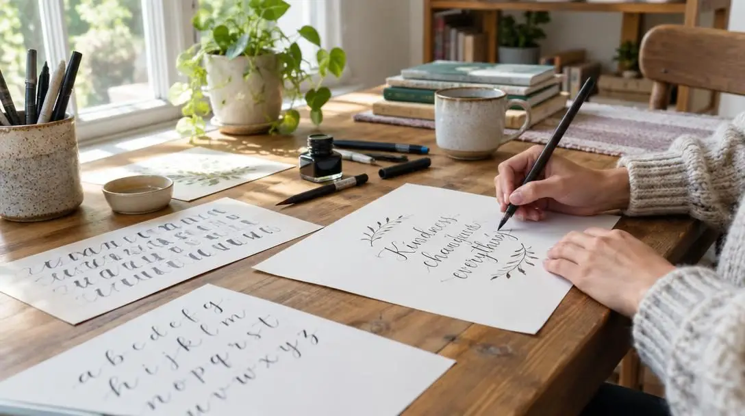
In an era dominated by uniform computer fonts, algorithmic text processing, and endless digital communication, the tactile craft of hand lettering offers a restorative creative sanctuary. Hand lettering, frequently practiced under the broader umbrella of modern calligraphy, approaches written language from an illustrative perspective. Rather than jotting down cursive words in a single, unbroken line, the letterer treats every individual character as a miniature visual composition, deliberately tuning its curves, weight, proportions, and negative space.
This discipline bridges the gap between traditional penmanship and graphic illustration, making it accessible to anyone with a pen and a sheet of smooth paper. By mastering basic stroke mechanics, learning how changing pressure creates dynamic line variation, and cultivating patience through repetitive drills, beginners can transform everyday words into captivating art pieces that carry tangible human personality.
Key takeaways
- Hand lettering is the art of drawing letterforms through individual, constructed strokes rather than flowing cursive penmanship.
- Modern calligraphy offers expressive freedom by allowing writers to break rigid historical rules while honoring traditional stroke mechanics.
- Line weight variation depends entirely on the universal rule of light pressure on upstrokes and firm pressure on downstrokes.
- High-quality, ultra-smooth paper is essential for protecting flexible pen tips and preventing ink feathering or bleeding.
- Deliberate warm-up drills and basic stroke shapes build the muscle memory required to assemble well-proportioned letters.
Demystifying the craft: Lettering, calligraphy, and typography
Before putting pen to paper, it is helpful to clarify how hand lettering fits into the broader universe of letter arts. While the terms hand lettering, modern calligraphy, traditional calligraphy, and typography are often used interchangeably in casual conversation, each discipline operates with distinct tools, technical approaches, and creative intentions.
Hand lettering is primarily an illustrative exercise. Instead of writing words in a continuous, flowing rhythm, an artist actively drafts, sculpts, and shades the outlines of letters. Characters are built from multiple composite strokes, allowing for corrections, embellishments, and custom adjustments tailored to a specific layout. In contrast, traditional calligraphy relies on strict historical scripts, such as Copperplate, Gothic, or Spencerian, which demand exacting pen angles, consistent x-heights, rigid slant standards, and specialized tools. Modern calligraphy bridges these two worlds by utilizing flexible nibs or brush pens to create variable-weight scripts, but it intentionally discards strict formal rules to accommodate playful letterforms and organic bouncing baselines.
| Discipline | Primary Method | Mechanical Freedom | Typical Media |
|---|---|---|---|
| Hand Lettering | Drawing, sculpting, and illustrating composite characters | Completely flexible, allowing custom decorative elements | Pencils, fine liners, markers, chalk, digital styluses |
| Modern Calligraphy | Writing fluid letterforms with pressure-sensitive strokes | Flexible baselines, expressive swashes, and varied sizing | Brush markers, pointed dip nibs, bottled inks |
| Traditional Calligraphy | Executing structured historical scripts stroke by stroke | Strict adherence to historic angles, heights, and ratios | Dip pens, broad-edge nibs, specialized calligraphic ink |
| Typography | Arranging and setting pre-designed letter systems | Governed by mechanical grids and system kerning rules | Movable metal type, digital font software, vector engines |
Essential tools for beginners
Starting out in modern calligraphy does not require an intimidating financial commitment or an elaborate studio workshop. Working with appropriate, reliable materials, however, prevents early frustration and ensures that your tools respond correctly to shifts in hand pressure.
Brush pens and markers
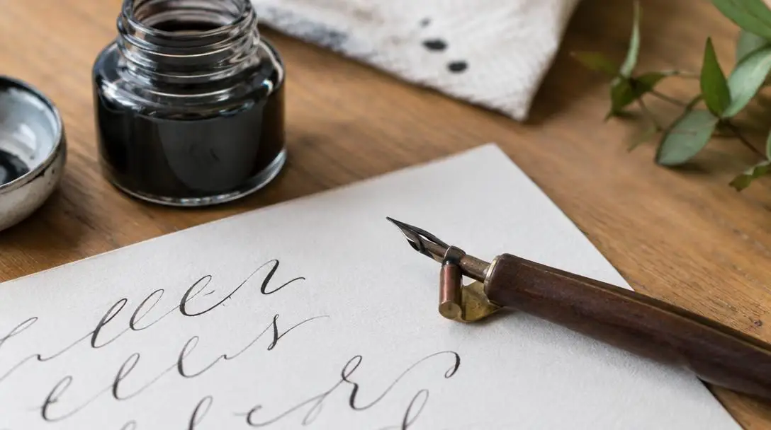
Modern brush pens are the most popular entry point for beginners. Fitted with flexible synthetic felt or resilient nylon bristle tips, these instruments mimic the behavior of a fine watercolor brush combined with the convenience of an internal ink reservoir. Small, firm brush tips provide exceptional control for compact lettering, while large, supple markers yield bold, sweeping strokes for dramatic signage. Practitioners seeking an older aesthetic often choose flexible metal dip nibs seated in ergonomic pen holders, dipping directly into inkwells to achieve hairline flourishes.
Paper surfaces
The paper you choose plays an enormous role in your lettering success. Standard copy paper and coarse sketchbooks possess rough, thirsty fibers that pull wet ink outward through capillary action, resulting in muddy edges known as feathering. Furthermore, abrasive textures can permanently fray delicate brush tips in a matter of hours. Beginners should invest in marker paper, smooth vellum, or coated, heavyweight sheets that allow pen tips to glide effortlessly across the surface without snagging.
Rulers and measuring guides
A transparent plastic or metal ruler is an indispensable drafting companion. Clean compositions depend on invisible structural frameworks: baselines to keep your words grounded, waistlines to regulate the lowercase body height, and ascender and descender boundaries to balance loops. Lightly sketching reference lines with an erasable graphite pencil establishes a secure perimeter, preventing your sentences from drifting downhill or slanting inconsistently.
Tracing paper
Tracing paper serves as an exceptional training bridge during the early phases of skill acquisition. Its silky, non-absorbent texture protects sensitive markers from friction damage while allowing complete visibility of guides underneath. Beginners can overlay tracing sheets across printed letter exemplars, repeating foundational curves over and over to develop muscle memory without depleting expensive master pads.
The mechanics of strokes and pressure
Every letterform in modern calligraphy is governed by a singular, foundational mechanical relationship: the interaction between direction, hand pressure, and line thickness. Beautiful scripts are never scribbled in a hasty motion; they are constructed methodically by shifting weight on the page.
The golden rule of modern calligraphy is universal across flexible tools: lift your weight for delicate upward motions, and press firmly for bold downward strokes.
Understanding these two foundational movements creates the building blocks for the entire alphabet:
- Upstrokes: When moving your writing tool upward away from your body, apply the lightest possible hand pressure. Only the microscopic tip of the brush marker or the joined tines of a dip nib should graze the paper, yielding a sharp hairline stroke.
- Downstrokes: When drawing the tool downward toward your body, exert firm, steady, and intentional pressure. This downward force bends the synthetic brush tip or splays open the flexible metal tines of a nib, depositing an abundant line of ink to create a robust, dark stroke.
Once you internalize this contrast, you can master foundational shapes such as the underturn and overturn. The underturn begins with a thick, pressurized downstroke that curves smoothly along the baseline before sweeping upward into a light hairline. Conversely, the overturn starts with a thin upstroke, rounds over the top waistline, and descends into a bold downward stroke. Master these two components, and you possess the anatomical framework for letters like "n," "m," "u," and "y."
Step-by-step practical exercises
Developing fine motor coordination requires a structured training progression. Approaching your practice sessions in deliberate steps will help your hands internalize the transitions without suffering from muscle fatigue or irregular execution.
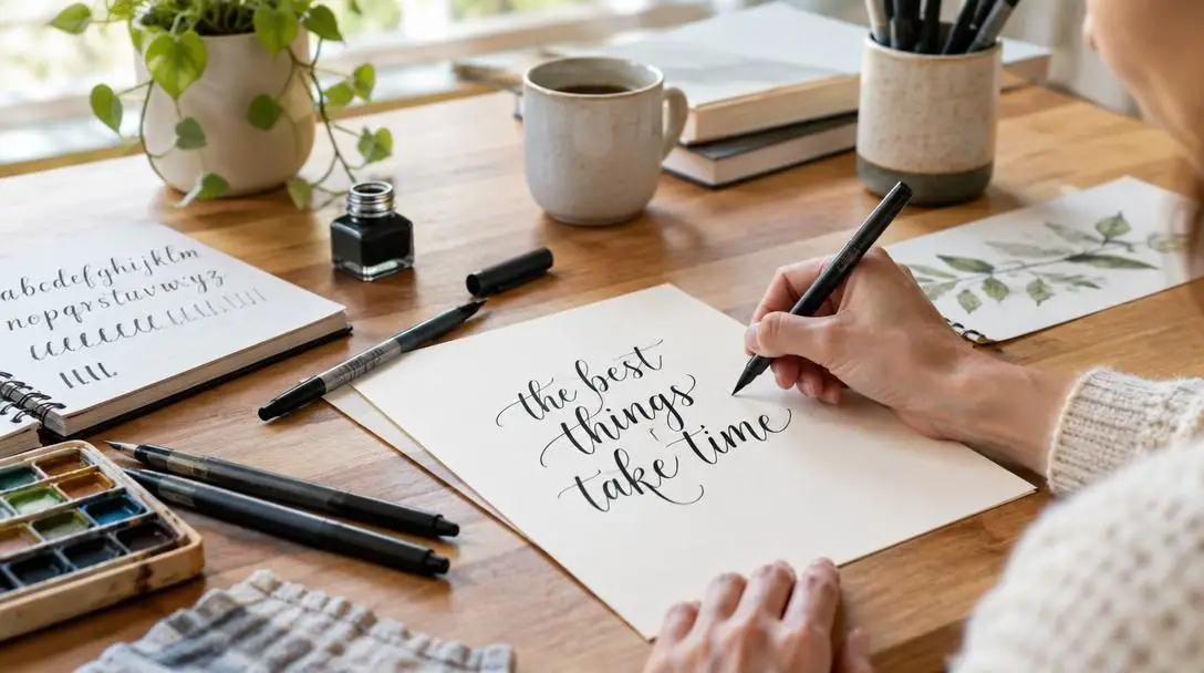
- Set up an ergonomic workspace: Sit upright in a comfortable chair with your feet flat on the floor to stabilize your upper body. Angle your practice sheet at approximately 30 to 45 degrees to match the natural sweeping radius of your writing arm, and draw faint pencil guidelines using your ruler.
- Perform isolated warm-up drills: Dedicate the first ten minutes of your practice to rhythmic, non-alphabetical strokes. Draw parallel rows of hairline upstrokes, followed by rows of uniform downstrokes, compound curves, and symmetrical ovals to loosen your fingers and calibrate pressure transitions.
- Deconstruct and build single letters: Select one character at a time and break it down into its separate structural strokes. For example, construct a lowercase "d" by executing a standalone oval stroke, followed by a separate tall ascender downstroke that terminates in a subtle exit flick.
- Practice dedicated character repetition: Fill several guideline rows with the same letter, pausing between each stroke to analyze symmetry, slant angle, and weight consistency before moving to the next character in the alphabet.
- Connect letter pairs: Once individual letterforms feel stable, practice joining common pairs such as "th," "in," and "on." Focus entirely on the transitional upstrokes bridging one character to the next, keeping spacing rhythmic and visually balanced along your baseline.
- Draft and ink complete compositions: Expand into full phrases or inspirational quotes. Use a light pencil to sketch bounding boxes, locate your focal center point, and map out word hierarchies before applying permanent ink over the composition.
Common beginner mistakes to avoid
Because modern calligraphy celebrates personal creative interpretation, beginners often fall into counterproductive mechanical habits that hinder their technical development. Identifying these pitfalls early will keep your lettering crisp, uniform, and visually compelling.
- Rushing the execution: Writing too rapidly destroys your ability to control gradual pressure shifts. Modern calligraphy is an art of slow, deliberate drawing; slowing down gives your hand time to transition smoothly from thin hair lines to heavy stems.
- Gripping the pen too tightly: A white-knuckled "death grip" strains finger tendons, locks your wrist, and results in jittery, nervous strokes. Keep your grip relaxed, holding the pen lightly so your larger wrist and forearm muscles can guide the motion.
- Neglecting consistent slant lines: While modern calligraphy does not demand the strict angles of traditional script, maintaining an identical slant across every letter is vital. A word containing both backward-tilted and forward-tilted stems looks jarring and messy.
- Skipping foundational drills: Diving directly into ornate flourishing and complex layouts before mastering the basic strokes invariably leads to unstable letter proportions and uneven line weights.
- Writing on abrasive or absorbent paper: Using standard printing paper or fibrous recycled pads ruins brush markers quickly through tip fraying and produces distracting bleed-through that degrades your ink work.
Creative applications for modern calligraphy
Developing proficiency in hand lettering is not merely an academic exercise; it offers versatile, rewarding practical applications across personal hobbies, lifestyle organization, and professional design projects.
- Bullet journals and daily planners: Hand-lettered headers, seasonal calendar displays, and habit trackers transform routine personal scheduling into an inspiring creative outlet.
- Event stationery and celebrations: Handmade invitations, place cards, reception menus, and envelope calligraphy add an intimate, bespoke touch to weddings, anniversary dinners, and milestone celebrations.
- Framed artwork and home decor: Standalone designs showcasing meaningful personal mantras, literary excerpts, or poetry make striking home decor items and thoughtful handcrafted gifts.
- Retail signage and packaging: Chalkboard cafe menus, storefront window lettering, seasonal merchandise labels, and gift tags offer commercial avenues for talented modern letterers.
Developing your personal style
After the mechanical discipline of thick downstrokes and thin upstrokes becomes instinctive, you can begin the exciting work of cultivating an authentic creative voice. Modern calligraphy encourages artists to experiment with stylistic modifications that reflect their personality.
One popular stylistic branch is bounce lettering, a technique where the natural baseline and waistline boundaries are playfully disrupted. Instead of resting every character along a rigid horizontal line, certain stems, loops, and underturns drop slightly below or bounce above the guide, producing a lighthearted, dancing rhythm. Other artists explore dramatic flourishes—extended, calligraphic loops that sweep gracefully out of entry and exit strokes to fill empty negative spaces within a composition.
Expanding your horizons also involves experimenting with diverse media. Once comfortable with basic brush pens, try dipping flexible pointed nibs into iridescent metallic gouache, blending multi-colored watercolor washes on heavyweight cotton paper, or translating your designs onto digital drawing tablets. Studying historical typography, vintage packaging, and architectural sign painting will continually supply fresh inspiration for new letter styles.
Frequently asked questions
Do I need good everyday handwriting to learn hand lettering?
No. Everyday handwriting is an unconscious, fast-paced method of recording information, whereas hand lettering is an intentional illustrative art form. Because you draw each letterform using composite strokes, lift your pen frequently, and work slowly, your handwriting habits do not dictate your lettering capability.
Why are the tips of my brush pens fraying so quickly?
Brush pen tips fray almost exclusively from friction against rough paper surfaces like ordinary printer paper or standard sketchbooks. To preserve your tools, always practice on ultra-smooth paper, bleedproof marker pads, or silky tracing paper, and avoid pressing down at a vertical 90-degree angle.
What is the difference between a dip pen and a brush pen?
A brush pen contains an internal ink reservoir and a flexible fiber or bristle tip, making it portable and easy to clean. A dip pen features a detachable flexible metal nib fitted into an ergonomic holder, which must be dipped manually into bottled ink to draw lines through the spreading of its metal tines.
How can I make my downstrokes straight and consistent?
Draw light pencil slant guidelines across your paper using a ruler before inking. When executing your downstrokes, engage your whole forearm rather than just wiggling your fingers, keeping your wrist locked in a comfortable, neutral position as you pull the pen downward.
How much time should I spend practicing each day?
Short, consistent practice sessions of 15 to 20 minutes per day are far more effective for building muscle memory than long, exhausting marathons once a week. Focusing on isolated stroke drills and a handful of characters each session prevents hand cramping and cognitive fatigue.
The bottom line
Hand lettering and modern calligraphy offer an accessible, rewarding blend of artistic discipline and expressive freedom. The craft requires neither expensive machinery nor innate illustrative genius—only a willingness to slow down, respect the balance between pressure and release, and embrace the rhythm of deliberate practice. By picking up a flexible pen, respecting your paper surfaces, and assembling letters stroke by stroke, you can step away from digital screens and rediscover the profound joy of making art by hand.