5 Monochromatic Color Schemes for a Timeless Design
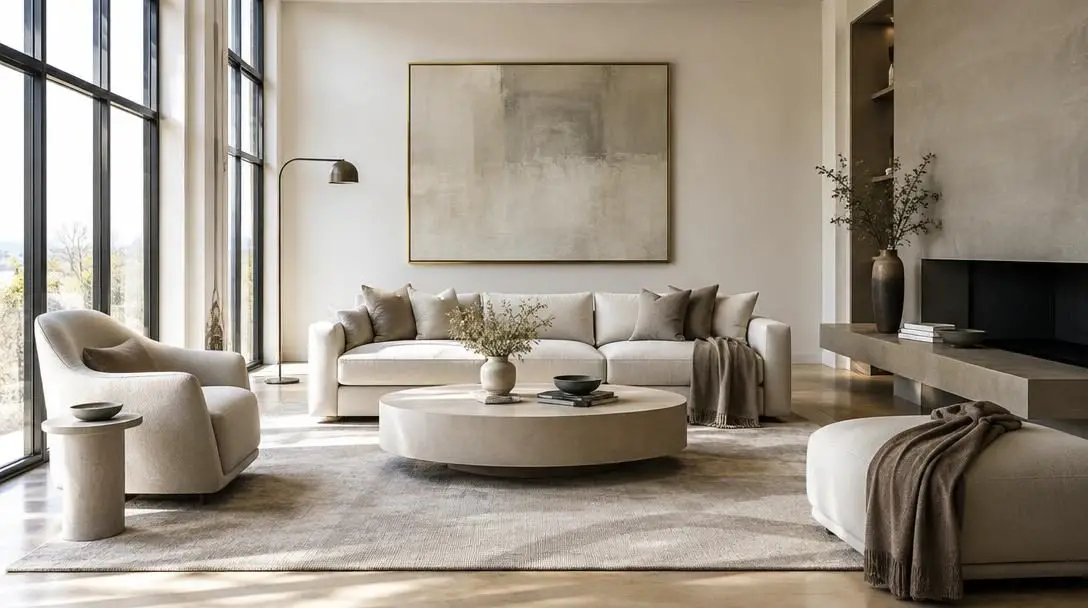
Monochromatic color schemes, widely celebrated in interior architecture as tone-on-tone design, rely on a deceptively straightforward visual concept: composing an entire room or graphic environment around gradations of a single base hue. Rather than attempting to balance competing hues from opposite sides of the color wheel, a monochromatic palette explores the visual depth, lightness, and subtle intensity present within one singular color family.
This focused approach eliminates the anxiety of clashing colors and directs the viewer's attention toward foundational design attributes like spatial scale, structural form, lighting balance, and tactile craftsmanship. From classical stone and plaster sanctuaries to mid-century modern interiors featuring subtle tonal gradations, tone-on-tone treatments bypass short-lived fads, delivering enduring visual harmony, deliberate elegance, and an innate sense of calm.
Key takeaways
- A monochromatic design relies entirely on the tints, shades, and tones within a single color family rather than competing hues.
- Strategic variations in texture, sheen, and material finish replace multi-color contrast to keep single-color spaces dynamic and tactile.
- Cool tone-on-tone schemes visually recede to expand compact rooms, while warm neutral palettes seamlessly connect adjoining spaces across an entire home.
- Careful lighting evaluation and undertone matching prevent monochromatic rooms from appearing flat, uninviting, or mismatched.
The Mechanics of Tone-on-Tone Interior Design
To execute a successful tone-on-tone palette, it helps to understand how a single color can be shifted across a space. A single color family is not just one flat shade repeated across every wall and surface; rather, it is expanded through three foundational color properties: tints, shades, and tones. A tint is produced by adding white to a pure hue, yielding softer, brighter variations that open up a room and maximize ambient light. A shade is achieved by introducing black, generating deeper, richer variants that provide structural weight, anchor furniture pieces, and add mood. A tone is formed by blending gray into the color, producing muted, nuanced variations that prevent saturated hues from feeling harsh or overwhelming.
When these balanced variations are distributed across an interior, the human eye reads the room as a cohesive, continuous entity rather than an arrangement of fragmented visual focal points. Light reflects differently off lighter tints and deeper shades, giving the space an organic sense of movement. Because the underlying color temperature remains uniform throughout the environment, the physical boundaries of the room soften, reducing visual clutter and allowing the mind to interpret the surroundings as open, organized, and tranquil.
When contrasting hues are removed, surface texture becomes the primary tool for generating visual depth and architectural interest.
Texture and surface finish play an indispensable role in tone-on-tone environments. When high-contrast color pairings are eliminated, the tactile qualities of surfaces do the heavy lifting of defining space. Light interacts with a flat matte wall very differently than it does with polished tile, honed natural stone, or woven textiles. The intentional juxtaposition between rough and smooth, or light-reflective and light-absorbent finishes, replaces conventional color contrast, ensuring that the finished interior feels layered, sensory, and richly engaging.
Five Timeless Monochromatic Color Schemes Compared
Selecting the right tone-on-tone scheme depends on the intended emotional atmosphere, the amount of natural daylight available, and the physical proportions of the room. The following comparison highlights how each core palette operates within an interior setting.
| Color Scheme | Dominant Mood | Primary Material Pairings | Spatial and Architectural Effect |
|---|---|---|---|
| Shades of Gray | Airy and serene to moody and dramatic | Matte paint, honed stone, polished tile, lacquered woodwork | Versatile backdrop that adapts effortlessly from modern to traditional forms |
| Blues | Calming, peaceful, and restorative | Natural wood grains, earthy stone, soft woven textiles | Visually recedes from view, creating an illusion of expanded space in smaller rooms |
| Greens | Refreshing, organic, and energizing | Mossy textures, dark foliage fabrics, polished warm metallics | Connects indoor spaces to the natural world while balancing calm and vibrancy |
| Neutrals | Sophisticated, warm, and inviting | Silk, velvet, bouclé, textured linen, natural stone | Establishes a continuous thread throughout multiple rooms and frames statement art |
| Black and White | Modern, minimalist, graphic, and chic | Geometric tiles, herringbone patterns, natural wood, woven fibers | Emphasizes architectural silhouettes, crisp lines, and high-contrast forms |
5 Monochromatic Color Schemes for a Timeless Design
Applying a tone-on-tone strategy requires selecting a color foundation that aligns with the intended mood and function of the space. Here are five monochromatic color schemes that you can use to achieve a cohesive, timeless, and sophisticated design:
Shades of Gray
- Atmospheric range: Light and airy to moody and dramatic
- Recommended surface finishes: Flat matte paint, honed stone, polished tiles, and lacquered woodwork
- Key design priority: Balancing light-absorbing and light-reflecting materials to avoid an industrial look
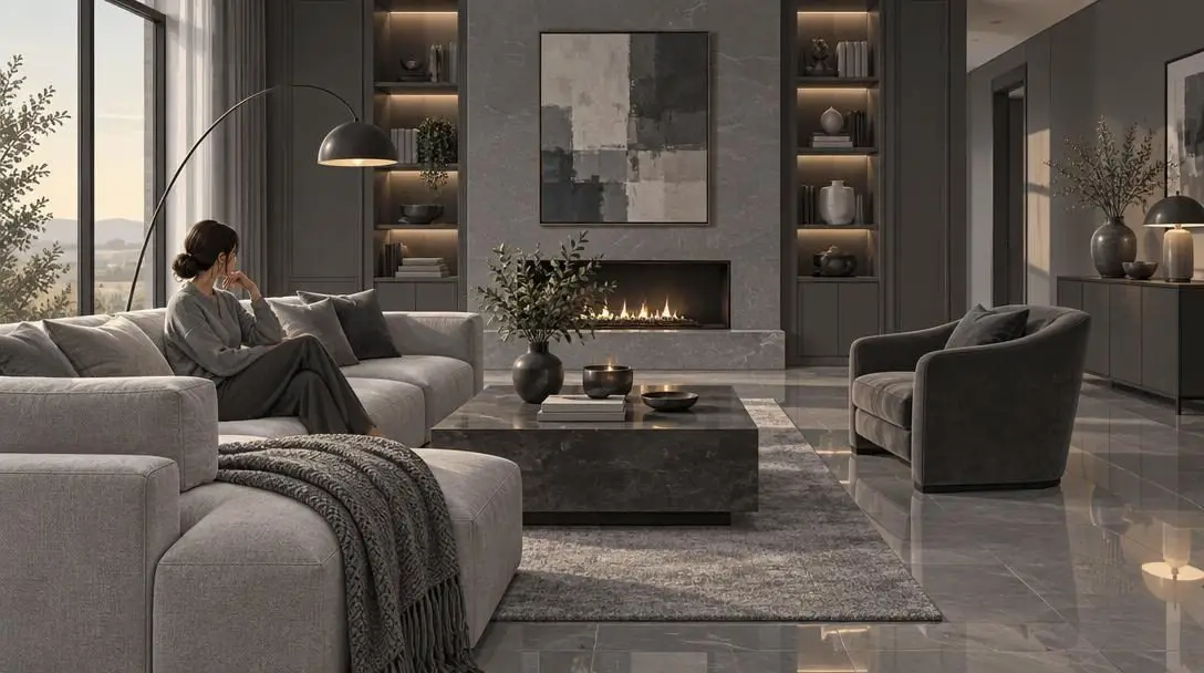
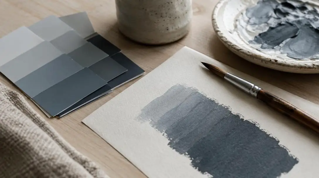
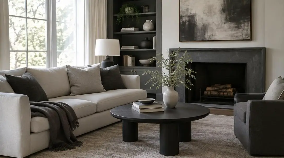
Gray is an exceptionally versatile color that can establish a wide variety of moods depending on the chosen shade. A monochromatic gray color scheme can range from light and airy to moody and dramatic. Pale gray surfaces reflect light gently, creating an expansive, peaceful atmosphere, while deep charcoal and slate tones provide an enveloping sense of drama and intimacy.
To make a monochromatic gray scheme truly successful, you must focus on playing with different textures and finishes. Combining matte surfaces, such as flat wall paint or honed stone, with glossy surfaces, such as polished tiles or lacquered woodwork, adds vital depth and interest to your design. This interplay of light-reflecting and light-absorbing finishes ensures that an all-gray room remains visually dynamic rather than flat or industrial.
Blues
- Atmospheric range: Serene, tranquil, and soothing
- Recommended material pairings: Warm natural timber and organic stone surfaces
- Spatial advantage: Cooler hues visually recede to make compact rooms feel expansive
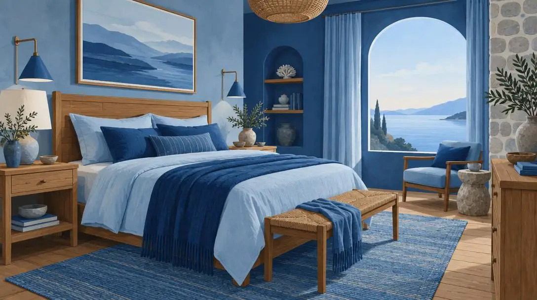
Blue is a calming and serene color that adapts naturally to many different spaces throughout the home, functioning equally well in bedrooms, living rooms, and bathrooms. A monochromatic blue color scheme can create a relaxing and peaceful atmosphere, helping to lower sensory overstimulation at the end of the day.
The natural tranquility of blue is particularly enhanced when paired with natural materials such as wood and stone. The organic warmth of timber grains and the earthy qualities of stone provide an ideal tactile counterweight to cooler blue tones. Additionally, using blue as the primary color in a room can create an illusion of depth and space. Because cooler tones visually recede from the viewer, an all-blue scheme can make walls feel farther away than they actually are, making it an ideal color choice for smaller rooms that need to feel more expansive.
Greens
- Atmospheric range: Refreshing, restorative, and energizing
- Layering strategy: Soft mossy undertones blended with dark foliage hues
- Recommended accents: Polished metallics for high-contrast luxury
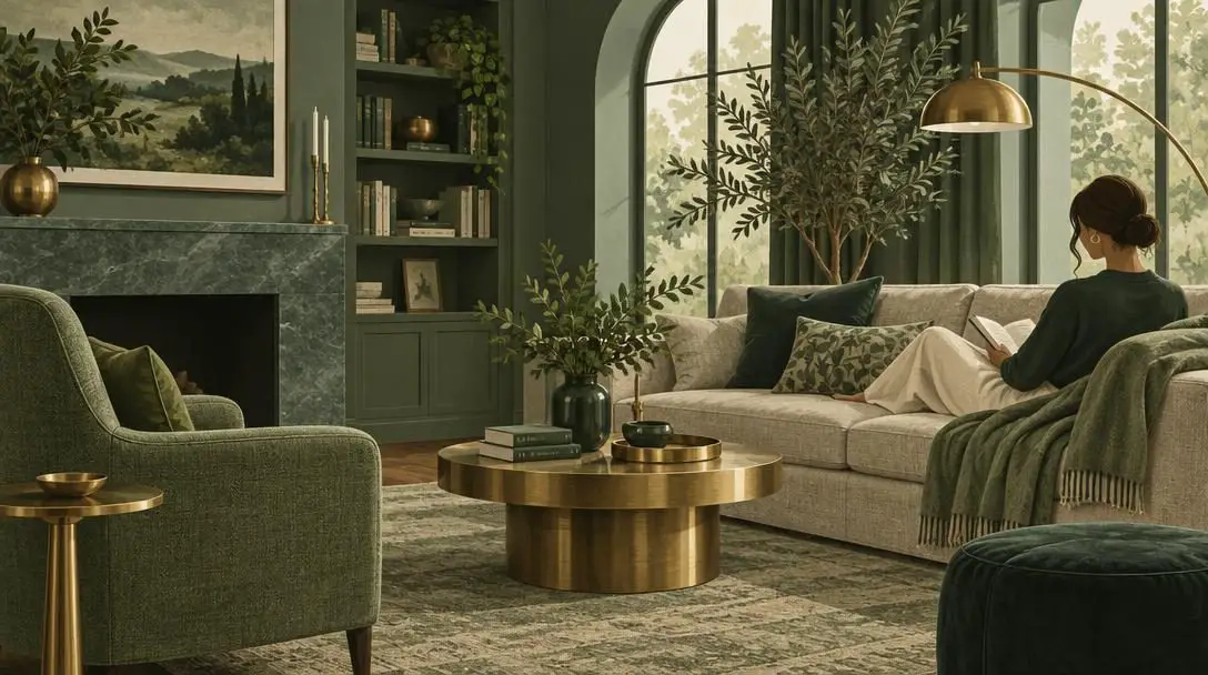
Green is a refreshing and energizing color that effortlessly brings a sense of nature into your space. A monochromatic green color scheme creates a cohesive look that is both relaxing and invigorating, bridging the gap between restorative calmness and lively vitality.
To prevent green from feeling static, introduce a layered mix of different shades and textures. Blending soft, mossy greens with richer, darker foliage hues builds an earthy, organic foundation. You can elevate this natural atmosphere by incorporating shiny metallics alongside your green elements. The contrast between deep, mossy organic textures and polished metallic details creates a dynamic and interesting design that feels curated and luxurious.
Neutrals
- Color foundation: Classic beige, taupe, and ivory
- Atmospheric range: Warm, grounded, calming, and elegant
- Key material pairings: Tactile textiles including silk, velvet, and woven linen
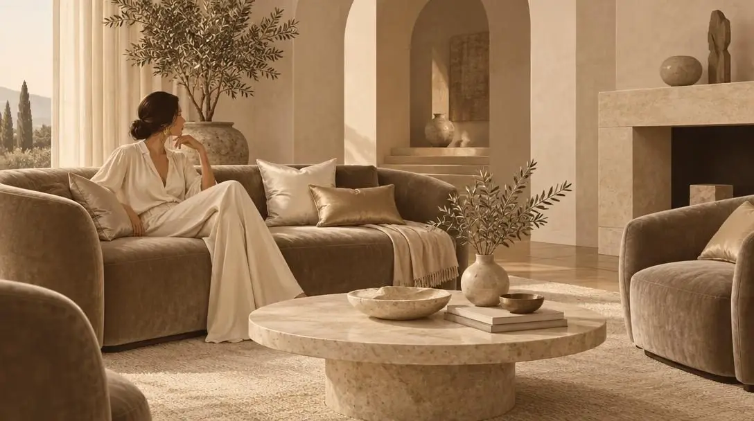
Neutrals such as beige, taupe, and ivory are classic colors that form the foundation of a timeless and elegant design. A monochromatic neutral color scheme creates a calming and sophisticated atmosphere that avoids stark contrasts, fostering a welcoming and grounded environment throughout the space.
To keep a neutral room engaging, pair these understated colors with luxurious materials such as silk and velvet. The tactile richness of high-end fabrics brings out the subtle shifts between beige, taupe, and ivory, ensuring the room feels comfortable and opulent. Beyond their standalone elegance, neutral colors provide a great backdrop for bold accessories and artwork, allowing specific statement items to shine without visual competition. Furthermore, neutrals can be utilized to establish a cohesive design throughout your entire home by carrying similar shades seamlessly from one room to the next.
Black and White
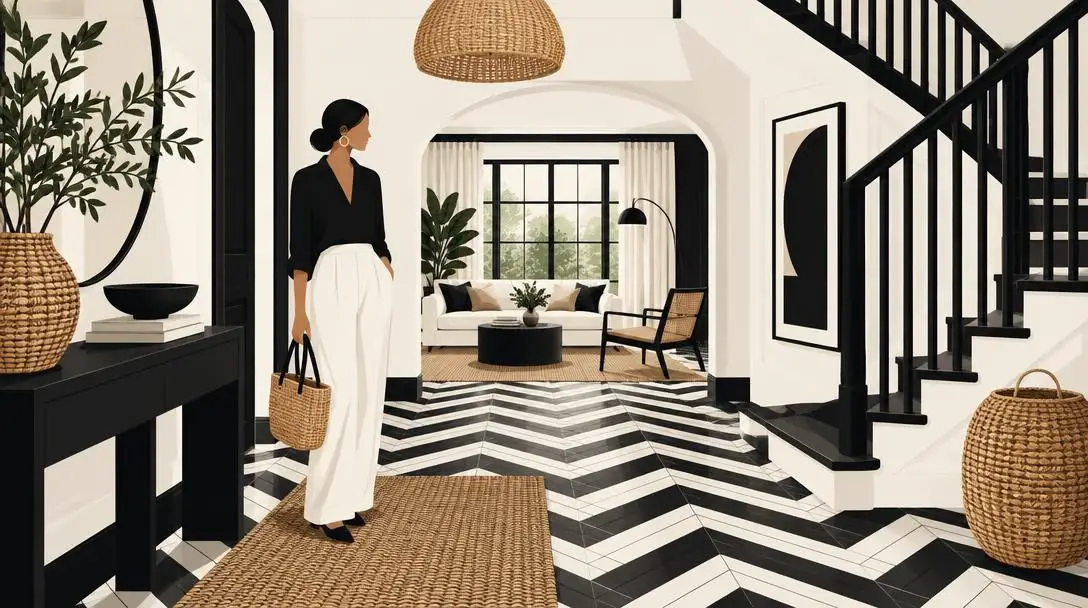
- Atmospheric range: Modern, chic, bold, and architectural
- Design focus: Crisp silhouettes, sharp geometries, and clean line work
- Softening techniques: Natural woven materials and geometric pattern variations
Black and white is a classic color combination that never goes out of style. A monochromatic black-and-white color scheme creates a modern and minimalist design that is both timeless and chic. By distilling the color palette down to pure contrast, this design emphasizes shape, line, and architectural silhouette.
To keep a black-and-white palette from feeling cold, stark, or overly clinical, focus on playing with different patterns and textures. Introducing geometric shapes—such as grid-like arrangements, herringbone layouts, or bold graphic prints—adds rhythm and energy to the space. Balancing these stark patterns with natural materials softens the visual sharpness, resulting in a dynamic, interesting design that feels both grounded and intentionally composed.
Practical Steps for Implementing a Monochromatic Palette
Executing a tone-on-tone design requires careful planning to ensure the space feels layered rather than flat. Following a structured process will help you balance tones, materials, and light effectively:
- Select your dominant base color: Choose the core color that best matches the purpose and emotional tone of the space. Consider whether you want the room to feel soothing like blue, refreshing like green, dramatic like gray, or grounded like neutrals.
- Build a spectrum of tints, shades, and tones: Gather swatches, paint chips, and material samples representing light, medium, and dark variations of your chosen color family. Aim to have at least three distinct values within that single color to create depth.
- Assign values to surfaces based on scale: Decide how the different values will be distributed across the room. Use lighter tints on expansive surfaces like ceilings or large walls to maintain an open feeling, and reserve deeper shades for cabinetry, feature millwork, or larger upholstered furniture.
- Layer diverse textures and materials: Integrate a variety of surface treatments. Bring together woven fabrics, smooth painted finishes, natural wood grains, stone surfaces, and metals that align with your overall color family. Ensure that no two adjacent large surfaces share the exact same texture.
- Incorporate varied sheen levels: Balance the reflective qualities of the room by using matte, satin, semi-gloss, and high-gloss finishes. Use matte surfaces to absorb light and create intimacy, and use glossy or metallic accents to bounce light across darker corners.
- Adjust lighting for tone consistency: Evaluate how artificial and natural light interact with your chosen palette throughout the day. Ensure that warm or cool light bulbs do not distort the undertones of your monochromatic scheme.
Common Mistakes to Avoid
While monochromatic schemes simplify color choices, they present their own unique design challenges. Being aware of frequent missteps can save you from a flat or uninviting result:
- Using only one value of the color: Applying the exact same shade across walls, flooring, and furniture creates a flat, two-dimensional effect. Without contrast between light and dark versions of the color, the room loses its sense of dimension.
- Ignoring texture: Forgetting to incorporate diverse materials is the primary reason tone-on-tone rooms can feel sterile. Without varied textures like velvet, silk, matte surfaces, or natural stone, a single-color space can look unfinished.
- Overlooking undertones: Colors within the same family can carry different undertones, such as warm yellow-greens versus cool blue-greens, or warm beige versus cool gray. Mixing conflicting undertones without care can make elements appear dirty or mismatched.
- Neglecting artificial lighting: Monochromatic rooms rely heavily on shadows and highlights to define shapes. Inadequate or overly harsh lighting can wash out the subtle differences between your tints and shades, flattening the design.
- Creating excessive contrast without transitions: In schemes like black and white, jumping straight from stark white to deep black without transitional mid-tones or textures can cause visual fatigue.
What to Consider Next
Once you have selected a monochromatic palette and mapped out the core elements of your space, there are several broader factors to consider as you bring your project to completion.
First, evaluate how natural light shifts through the room across different seasons and times of day. A monochromatic scheme that appears airy under bright morning sun might feel dim or cold under overcast skies. Testing your paint swatches and material samples on different walls over several days will confirm that the tonal shifts remain pleasing in all lighting conditions.
Next, consider how the design of an individual room connects to the rest of your home. If you are using neutrals to establish a cohesive thread throughout multiple spaces, decide which specific elements will carry from room to room to maintain visual continuity. Conversely, if you are designing a distinct, jewel-toned blue or refreshing green room, plan how the entrance to that space transitions from adjoining hallways or adjacent rooms.
Finally, think about long-term flexibility. A classic tone-on-tone foundation provides an adaptable backdrop that can evolve as your needs change. Because your foundational surfaces—such as flooring, wall finishes, and primary furnishings—remain unified and timeless, you can easily refresh the room over time by swapping accessories, updating artwork, or introducing new natural materials without ever disrupting the core harmony of your design.
Frequently asked questions
What is the difference between a tint, a shade, and a tone?
A tint is created by mixing white into a pure base color to produce a lighter, brighter value. A shade is created by adding black to produce a deeper, heavier variation. A tone is created by adding gray, which softens and mutes the intensity of the hue to produce subtle, complex color shifts.
Can a monochromatic color scheme make a small space look larger?
Yes. Cooler palettes such as tone-on-tone blue visually recede from the eye, blurring structural boundaries and making perimeter walls appear further away than they actually are. Using lighter tints across large expanses like ceilings and main walls enhances this open, airy sensation.
Why do tone-on-tone rooms often look flat or uninviting?
Monochromatic rooms usually fall flat when they rely on a single color value or ignore surface texture. When hue contrast is absent, the eye needs tactile contrast—such as combining matte wall paint with polished stone, high-gloss accents, and woven textiles—alongside varying light, medium, and dark values to perceive dimension.
Is black and white considered a monochromatic color scheme?
Yes. Black and white represents a classic monochromatic approach that reduces color to pure contrast and value. It relies on architectural silhouettes, geometry, pattern play like herringbone or grids, and natural textures to create depth without introducing extraneous chromatic hues.
How can I introduce accents into an all-neutral space without ruining the palette?
Neutral schemes composed of beige, taupe, and ivory act as a calm, cohesive foundation. You can showcase bold accent pieces, statement artwork, or luxurious textiles like silk and velvet without disrupting the palette, because the neutral surroundings eliminate visual competition and let individual forms shine.
The bottom line
Monochromatic design is far more than a minimalist exercise in repetition. By exploring the full spectrum of tints, tones, and shades within a single color family, tone-on-tone interiors offer a sophisticated balance of visual calm and rich tactile complexity. Whether you choose the enveloping drama of charcoal gray, the expansive calm of deep blue, the organic energy of green, the quiet opulence of layered neutrals, or the graphic precision of black and white, a single-hue foundation provides enduring elegance that withstands shifting trends and adapts effortlessly for years to come.